Lower-income Metros More Negatively Exposed to Rising Food & Energy Costs
Admir Kolaj, Economist | 416-944-6318
Date Published: May 4, 2022
- Category:
- Us
- Consumer
- State & Local Analysis
Highlights
- Russia's war in Ukraine has led to a higher price environment for several important commodities, including agricultural, fertilizers, and energy. As these elevated commodity prices continue to work their way through supply chains, further increases in food prices will likely materialize in coming months.
- In this report, we examine 23 metro areas across the U.S. to assess which markets are likely to be more negatively impacted from rising food and elevated energy costs. Our analysis shows that an average household in Riverside (California), Atlanta, Anchorage (Alaska), Houston, and Detroit, which tend to rank at the lower end of the income scale, is comparatively more exposed.
- At the other end of the spectrum, households in higher-income metros such as San Francisco, Boston, Washington D.C., and Seattle, where food and energy tend to make up smaller shares of the CPI basket, are generally in a relatively better position to absorb higher prices in these two categories, all else equal.
- Wage growth can either help alleviate or worsen commodity-driven inflationary pressures. Benchmarking food and energy inflation against wage growth shows that some of the more vulnerable metros to rising food and energy prices, such as Riverside (California) and Anchorage, also lag behind on wage growth – a factor that does little to help their position. Sitting in a much better spot are households in metros such as Boston and Seattle, with the latter not only ranking at the higher end of income scale but also recording wage gains above the national rate.
In a report published at the end of last year, we found rising shelter costs to be a primary driver of overall inflation differences across U.S. metro areas – a story that still stands. In this follow-up paper, we recast the focus on the regional impacts of soaring food and energy prices, which have become even more topical following Russia's invasion of Ukraine. In March, total CPI inflation accelerated to 8.5% year-on-year (y/y). Food (8.8% y/y) and energy (32% y/y) make up about a fifth of the CPI basket but accounted for two-fifths of the overall inflation tally, meaning that they are punching about their weight. By comparison, the shelter component, which makes up about a third of the CPI basket and where price growth (5% y/y) continues to accelerate, accounts for about a fifth of current inflation.
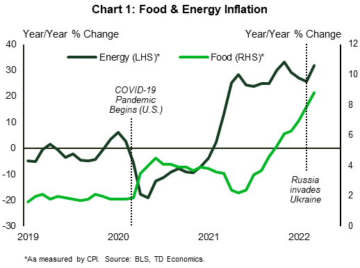
Food and energy costs were rising even before the war in Ukraine, with the upward trajectory partly the result of strong economic growth and ongoing supply-chain disruptions related to the pandemic (Chart 1). In the case of food, unsupportive weather conditions, which hit crop production and inventories globally, were also to blame. Accordingly, supply fears due to the war in Ukraine have hit markets at a time of heightened sensitivity, likely accentuating their impacts on prices.
Oil prices have come off recent highs, but remain above pre-war levels, with gasoline prices still some 90 cents/gallon higher than at the start of the year as a result. Meanwhile, elevated food commodity prices are poised to continue to ripple down the production supply chain to areas such as processed food products in the months ahead. Lower-wage Americans who devote a larger portion of their income to these essentials are more exposed to the price hikes. Negative impacts will vary, given both differences in income levels and the composition of consumer baskets among consumers across the country.
Why Russia-Ukraine matter for food and energy – a quick synopsis
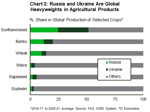
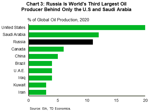
Combined, Russia and Ukraine are major global players with respect to several key commodities. These can generally be lumped into three main categories – the three Fs of food, fertilizer, and fuel. According to data from the Food and Agriculture Organization of the United Nations (FAO), Russia and Ukraine are net exporters of agricultural products, with both ranking among the top three global exporters of wheat, maize, rapeseed, along with sunflower seed and sunflower oil (Chart 2). Russia, meanwhile, is a heavyweight in both the fertilizer space (it is the world's top exporter of nitrogen fertilizers, second in potassium fertilizers and third in phosphorous fertilizers) and oil & gas (Chart 3).1
The war ultimately limits the supply of Ukrainian and Russian goods to markets and forces a realignment in trade flows to other suppliers. In the case of Ukraine, this is the direct result of the war, which has destabilized production, destroyed infrastructure and crops, and disrupted supply chains. In the case of Russia, the barriers center around sanctions.
To be clear, the U.S. has generally steered clear of sanctioning agricultural products and fertilizers (see exemptions here, which also include medicine, medical devices etc.), while important partners such as the E.U. continue to import plenty of oil and gas from Russia. That said, other sanctions, such as on Russian financial institutions and businesses, can still serve to limit trade even for products not directly targeted by sanctions. Russia's countermeasures – i.e., requests to get paid in Rubles for oil and gas, the imposition of quotas for sunflower oil, the banning of exports for sunflower seeds and rapeseeds, and the threat to supply only "friendly" countries with food and crop products – add to the disruption. The potential for an E.U. ban on Russian oil later this year, especially now that Germany has dropped its opposition to an embargo, remains an important upside risk for energy. Meanwhile, signs of rising crop protectionism among countries not directly involved in the conflict, such as the recently expanded palm oil export ban from Indonesia, the world's largest exporter of palm oil, speak to widening pressures across global agricultural supply chains.
Commodity markets point to more cost-push inflation
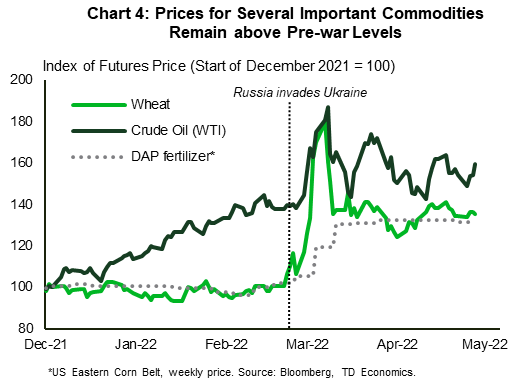
Given the above, it is no wonder that prices for agricultural products, fertilizer and energy are all well above pre-war levels (Chart 4). These are important inputs into a host of consumer and food products, whose prices also poised to increase as costs are passed on.
The interdependence between affected commodities can also accentuate price pressures. For example, natural gas is an important ingredient in the production of fertilizers and fertilizers are an important ingredient in the production of agricultural products. Plenty of agricultural products, meanwhile, are also used to raise livestock. As such, higher direct input costs would need to be passed through the supply chain, resulting in upward price pressures on various food products. Elevated fuel prices, meanwhile, would add to transportation costs – yet another related input cost that can accentuate cost-push inflation.
The degree to which consumer prices rise, however, will depend on a host of other factors too, including labor costs (which are also on the rise), market competition and price-elasticity for said products, along with profit margins for firms along the supply chain (i.e., producers, wholesalers, retailers). Given their essential nature, both food and fuels tend to be fairly price inelastic – that is price changes for these products tend to result in relatively small shifts in demand. That said, there can still significant variation within categories. Snacks, for example, are a lot more price elastic than staple foods, which means consumers would be more willing to forego snacks when prices increase. Such items are prime candidates to see some of the added costs absorbed by firms along the supply chain, resulting in thinner profit margins for them.
Lower-income consumers more exposed to rising food and energy costs
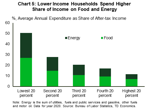
While all consumers will feel the sting from higher food and energy prices, lower-income consumers will feel it more than others. The reason is simple – they tend to devote a larger share of their earnings toward these essential items. The lowest 20% of income earners spend roughly half of their after-tax income on food and energy, with the other half typically devoted to shelter. While this does not leave much for anything else, recall that it is possible for low-income households to consume more than they earn in a year once government support measures or borrowing are factored in. That said, the lower the earnings, the larger the share of funds devoted to essential items such as food and energy (Chart 5). Lower-income consumers may see some respite from a tightening labor market, which, just as 'a rising tide lifts all boats', should help boost wage growth for most workers. Still, the main point is that lower-income households generally have less room to absorb rising costs for non-discretionary items compared to their higher-income counterparts.
The fact that lower-income households tend to have little savings or accumulated wealth is another factor that makes it more challenging for that segment to absorb rising costs. While American households were, in general, in a better financial position at the start of 2022 than in 2019, a recent study notes that households with the lowest incomes recorded the smallest wealth gains over the same period, both in dollar terms and percent terms. On the other hand, higher income households, which tend to have more real estate and equity holdings, have come out of the pandemic in a much better financial position and should have more cushion to weather rising prices for essential items. In addition, the winding down of pandemic-related support programs, including the recent end to enhanced child tax credit – a maximum payment of $3600 per child, with half the credit disbursed through monthly installments – will add to difficulties for lower-income households. Many families will still see a benefit by claiming half the enhanced credit once they file their 2021 taxes this year, but the overall child tax credit for 2022 has reverted to its previous $2000 maximum.
Some metro areas more negatively affected than others
Scanning the largest 23 metro area across the country (for which timely inflation data is available) current readings on food inflation vary from more than 10% y/y in metros such as St. Louis, Baltimore and Seattle, to a low of 4% y/y in Miami, the latter being an outlier (Table 1). Part of what Miami residents appear to be saving on food is being spent on energy, where price gains have been the highest so far this year.
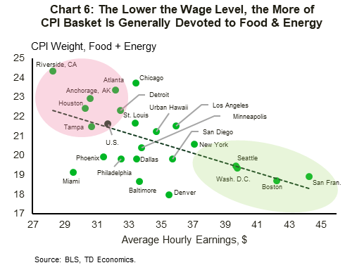
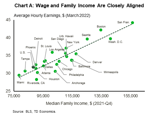
To gauge which metro areas are more negatively impacted from food and energy price hikes, income performances become a key consideration. We focus on average hourly earnings, given that they are timely, higher frequency and are closely aligned to overall income data (see Chart A in the Appendix). In Chart 6, we can see that the lower average hourly earnings are, the more funds are generally devoted toward food and energy. Metros that fit this profile include Riverside (California), Atlanta, Anchorage, Houston, and Detroit, among others.
At the other end of the spectrum, consumers in higher-income metros such as San Francisco, Boston, Washington D.C., and Seattle, among others, devote relatively fewer dollars toward food and energy, with these items having smaller weights in their CPI consumer baskets. In these higher-income markets, households are likely to experience a comparatively smaller hit, when all else is equal.2
Table 1: Food & Energy Inflation, along with Wage Metrics
Table 1 shows total year-over-year inflation as measured by CPI, food inflation, energy inflation, food & energy inflation combined, along with year-over-year wage growth and average hourly earnings (i.e., wage level) for March 2022, for 23 metro areas and the United States. March data for food and overall inflation is not available from the source for some metros, and has been estimated. The table is color-coded. The highest inflation readings are colored in dark red to signifying strong inflationary pressures and elevated concern; the lower inflation readings are colored in dark green (signifying softer inflationary pressures). The exact opposite color scheme is used for the corresponding wage metrics, with the highest wage growth and wage levels colored in dark green to signify better outcomes.
| Metro Area | Year-over-Year % Change | Level | |||||
| March 2022* | |||||||
| Total Inflation | Food Inflation | Energy Inflation | Food & Energy Inflation Combined** | Wage Growth | Average Hourly Earnings | ||
| U.S. | 8.5 | 8.8 | 32.0 | 16.7 | 5.6 | 31.7 | |
| Anchorage, AK | 7.8 | 9.9 | 23.7 | 14.3 | 3.3 | 30.6 | |
| Atlanta | 11.1 | 7.8 | 28.7 | 14.6 | 8.4 | 32.2 | |
| Baltimore | 9.8 | 11.3 | 28.1 | 17.8 | 3.8 | 33.7 | |
| Boston | 7.3 | 7.1 | 36.9 | 17.4 | 6.8 | 42.2 | |
| Chicago | 7.8 | 9.4 | 33.7 | 16.7 | 5.3 | 33.4 | |
| Dallas | 9.0 | 9.8 | 37.4 | 21.6 | 7.1 | 33.5 | |
| Denver | 9.1 | 9.1 | 28.1 | 14.9 | 5.9 | 35.5 | |
| Detroit | 8.0 | 8.7 | 28.4 | 15.6 | 8.9 | 32.5 | |
| Urban Hawaii | 7.5 | 9.5 | 32.6 | 16.7 | 0.6 | 34.7 | |
| Houston | 8.3 | 7.2 | 27.2 | 14.5 | 5.2 | 30.3 | |
| Los Angeles | 8.5 | 8.6 | 36.7 | 17.5 | 4.5 | 36.0 | |
| Miami | 10.4 | 3.8 | 43.4 | 19.6 | 9.0 | 29.5 | |
| Minneapolis | 8.2 | 7.9 | 30.9 | 14.9 | 3.2 | 33.8 | |
| New York | 6.1 | 8.0 | 32.7 | 15.0 | 3.3 | 37.1 | |
| Philadelphia | 8.1 | 8.4 | 31.4 | 16.6 | 3.0 | 32.5 | |
| Phoenix | 11.0 | 8.4 | 30.3 | 16.0 | 6.7 | 31.4 | |
| Riverside, CA | 10.0 | 8.1 | 38.6 | 21.4 | 3.1 | 28.3 | |
| San Fran. | 5.7 | 10.0 | 34.8 | 16.6 | 1.8 | 44.3 | |
| San Diego | 7.9 | 9.7 | 35.9 | 17.6 | 3.6 | 35.7 | |
| Seattle | 8.9 | 10.4 | 26.8 | 14.8 | 6.5 | 39.7 | |
| St. Louis | 8.5 | 11.6 | 30.6 | 17.7 | 8.8 | 33.4 | |
| Tampa | 10.2 | 8.2 | 31.1 | 15.5 | 9.6 | 30.7 | |
| Wash. D.C. | 7.3 | 7.2 | 27.8 | 13.0 | 3.3 | 39.8 | |
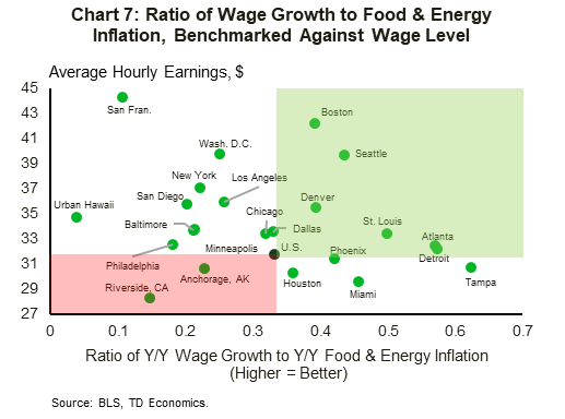
Changes in wages and incomes can either help alleviate or worsen commodity-driven inflationary pressures. Benchmarking food and energy inflation against wage growth helps give us an idea where wage purchasing power is doing a better job at keeping up with rising prices for these essential items. The relevant information from Table 1 is laid out in a clearer format in Chart 7. Looking at the latter, some of the usual suspects spring back up, with year-on-year wage growth in metros like Riverside (California) and Anchorage generally further behind combined food and energy inflation, relative to the rest of the group. Wage growth in metros such as urban Hawaii and San Francisco is not doing a good job at keeping pace with food and energy inflation either. From a purely wage-purchasing-power perspective, this is an issue. However, the fact that wage and income levels in San Francisco and urban Hawaii are much higher than in Riverside and Anchorage, reconfirm the notion that, overall, rising food and energy prices are much more problematic for the latter two metros.
Wage growth is ahead of the U.S. average and doing a relatively better job at keeping pace with rising food and energy inflation in several metros, including Miami, Detroit, and Tampa. However, the best outcomes are observed in metros such as Boston and Seattle, which are not only seeing above-average wage growth but also rank at the high end on wage and income levels.
Bottom Line
Food and energy costs were on the rise even before Russia's invasion of Ukraine. Both countries combined are major global players in the production of agricultural products, fertilizer and energy, among other things, with the war contributing to a higher price environment for these commodities. As these continue to find their way into consumer products, inflationary pressures for food products remain titled to the upside. Energy price pressures as expected to recede in the quarters ahead, however, the fallout from the war in Ukraine remains a wildcard, with the potential for an E.U. embargo on Russian oil later this year posing an upside risk.
Consumers in metro areas that tend to rank at the lower end of the income scale, and thus tend to gear more of their overall spending toward food and energy, are more exposed to price hikes for these essential items. Metros that fit the bill include Riverside (California), Atlanta, Anchorage, Houston, and Detroit. Higher-income metros, on the other hand, are in a generally better position to absorb higher prices for food and energy, given that the latter tend to make up smaller shares in their respective CPI baskets. Included in this list are metros such as San Francisco, Washington D.C., Seattle and Boston. The latter two are also recording above-average wage growth, which further improves their position in keeping up with rising prices.
Appendix
End Notes
- Food and Agriculture Organization (FAO) of the United Nations, "The importance of Ukraine and the Russian Federation for global agricultural markets and the risks associated with the current conflict", March 2022, see here.
- For the purposes of this report, we are examining food and energy inflation in a vacuum from other categories. That said, inflation in other weighty categories, such as shelter, has the potential to put a further squeeze on household budgets, including for high-income households, further limiting their ability to absorb rising food and energy prices. So far, however, shelter inflation in many of the aforementioned higher-income metros (i.e., San Francisco, Boston, Washington D.C., Seattle and New York) has generally come in on the softer side, thereby limiting some of the added pressure to household budgets through the shelter component.
Disclaimer
This report is provided by TD Economics. It is for informational and educational purposes only as of the date of writing, and may not be appropriate for other purposes. The views and opinions expressed may change at any time based on market or other conditions and may not come to pass. This material is not intended to be relied upon as investment advice or recommendations, does not constitute a solicitation to buy or sell securities and should not be considered specific legal, investment or tax advice. The report does not provide material information about the business and affairs of TD Bank Group and the members of TD Economics are not spokespersons for TD Bank Group with respect to its business and affairs. The information contained in this report has been drawn from sources believed to be reliable, but is not guaranteed to be accurate or complete. This report contains economic analysis and views, including about future economic and financial markets performance. These are based on certain assumptions and other factors, and are subject to inherent risks and uncertainties. The actual outcome may be materially different. The Toronto-Dominion Bank and its affiliates and related entities that comprise the TD Bank Group are not liable for any errors or omissions in the information, analysis or views contained in this report, or for any loss or damage suffered.
Download
Share: