Where Inflation Burns Hottest:
A U.S. Metro View of the Latest Price Surge
Admir Kolaj, Economist | 416-944-6318
Date Published: June 25, 2026
- Category:
- U.S.
- Real Estate
- Consumer
- State & Local Analysis
Highlights
- U.S. inflation has accelerated but inflation readings across key metro areas still show wide differences, ranging from less than 3% y/y in metros like Dallas, Houston and Atlanta to roughly 5% in New York, Urban Hawaii, Denver, Seattle, and Philadelphia.
- Energy inflation is running hot, putting upward pressure on all examined metros. But the shock is not landing evenly, with energy inflation ranging from 13% to 30% y/y across the cohort.
- Energy is not the whole story. Underlying inflation is generally strongest in metros where shelter costs remain elevated, while metros with cooler housing markets are seeing more muted core inflation — an important distinction for how quickly price pressures may ease.
- Real wage growth has turned negative in close to a third of metros examined in this report and is nearly flat in a handful of others. This raises the risk of a near-term discretionary spending squeeze in some local economies, even if national consumption growth remains decent.
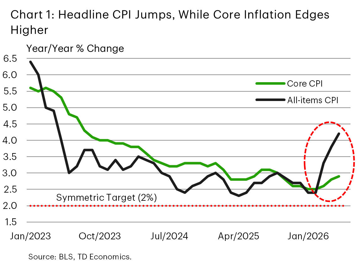
After cooling for much of the past year, U.S. inflation has moved back onto a firmer footing. Headline CPI inflation accelerated to 4.2% y/y in May, the highest reading in three years (Chart 1). The most obvious culprit is the recent energy shock, with transportation fuel costs jumping following the conflict in the Middle East and the disruption to oil flows through the Strait of Hormuz. Still, energy is not the whole story. Core inflation has also ticked higher, rising from 2.6% y/y earlier this year to 2.9% in May, moving further above the Federal Reserve’s 2% target.
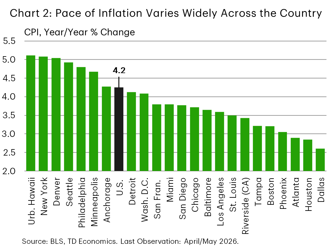
The national figures, however, mask important regional differences. Looking across the 23 metro areas for which timely CPI data are available, overall inflation is advancing at very different speeds. At the low end, headline inflation is running at just below 3% in metros like Dallas, Houston and Atlanta (Chart 2). At the other end of the spectrum, inflation is near 5% in places like New York, Urban Hawaii, Denver, Seattle and Philadelphia. In other words, the latest inflation rebound is a national story, but the lived experience is still very local.
Energy inflation is the spark, but the flame is uneven
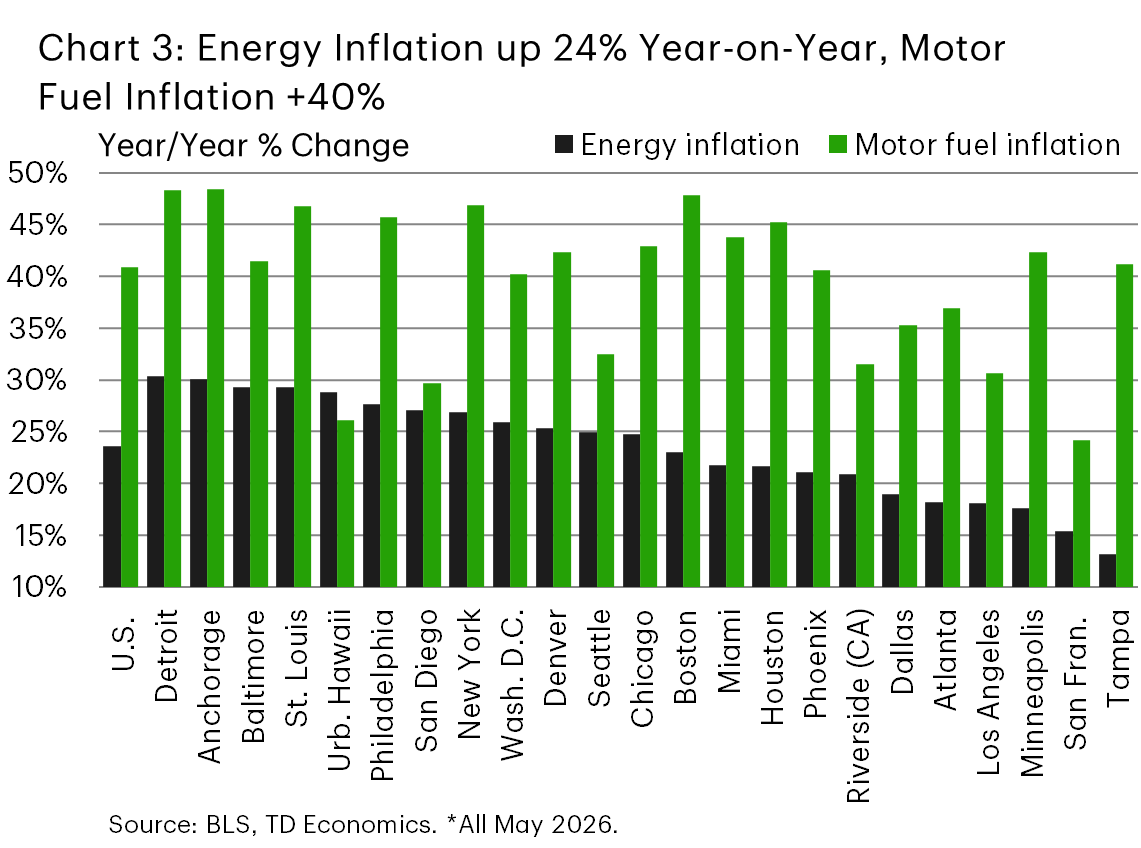
Energy inflation has moved sharply higher recently. Nationally, energy prices are up roughly 24% y/y, while motor fuel costs are up closer to 40%. That is a large enough increase to materially lift headline inflation across the country. But the magnitude varies widely by metro (Chart 3).
Energy inflation is running hottest at a pace near 30% y/y in metros like Detroit, Anchorage, Baltimore, St. Louis, and Urban Hawaii, with a few other large metro areas like Philadelphia, San Diego, and New York not far behind. By contrast, energy inflation has been more contained in places such as Tampa and San Francisco (13-15%), along with Minneapolis, Los Angeles and Atlanta (around 18%).
Part of the variation reflects the composition of household energy use. The CPI energy category includes gasoline and other motor fuels, but also electricity, utility gas service, fuel oil and other household fuels. Motor fuel prices are tightly linked to global crude oil markets and therefore react quickly to international supply shocks, while local factors — including tax structures at the state or local level, fuel blend specifications, and regional supply conditions — shape the extent to which those global price movements are reflected in local inflation readings. Electricity and utility gas prices, by contrast, are shaped more heavily by local regulation, generation fuel mix, delivery costs and regional utility dynamics. This means two households can face very different “energy inflation” experiences depending on where they live and how they heat, cool and move around.
That distinction between the overall energy category and motor fuels is important. While motor fuel costs are running hot at close to 50% y/y in a few familiar metros such as Anchorage, Detroit, New York, and Boston, fuel costs are up sharply even in a few metros where overall energy inflation is running at a much cooler pace, namely in Tampa and Minneapolis.
Pulling the lens back, the key takeaway is not just that energy prices are up, but that the same global oil shock is being filtered through very different local cost structures. That helps explain why headline inflation has climbed much more sharply in some metros than in others.
Text Box: A note on metro CPI timing
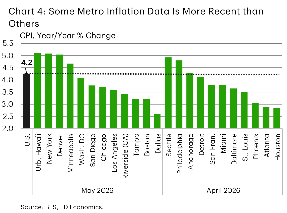
Metro CPI data do not all update on the same monthly schedule. The Bureau of Labor Statistics (BLS) publishes the largest metro areas, such as New York, Los Angeles and Chicago, each month, while most other metro areas are published every other month on an alternating schedule. As a result, the latest readings for some metros reflect May 2026 data, while others are still based on April 2026 (Chart 4). This matters in the current environment because the energy shock intensified through spring, meaning the May-reporting metros capture more of the latest price surge.
There is an important nuance, however. Some categories, including energy and shelter, are available monthly across the metro set. This makes it possible to compare the latest energy and shelter dynamics more consistently across cities, even when the headline metro CPI readings are not all on the same publication month.
Core inflation: shelter is still doing much of the heavy lifting
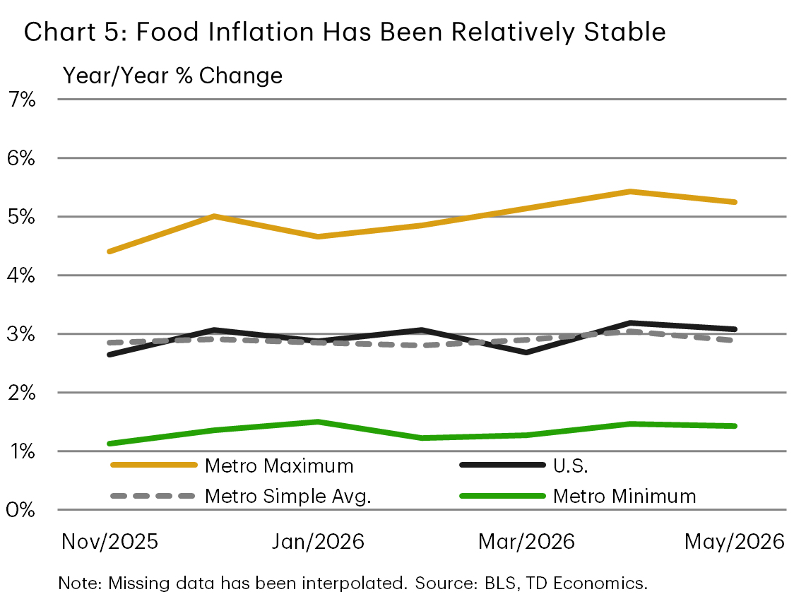
Food inflation – the other volatile category typically omitted from core measures – has been relatively stable, running at roughly 3% y/y nationally over the last several quarters. A similar theme is reflected across the key metros examined in this report. Differences exist of course, and a couple of metros have recorded an acceleration (i.e., Boston, Philadelphia), while others have seen a slowdown (i.e., Tampa, Miami). But in general, food inflation has been relatively stable across the cohort (Chart 5). Looking past food and energy, when it comes to core inflation measures, shelter remains generally the central story.
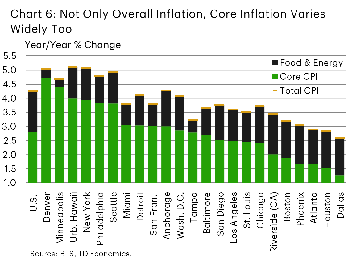
A recent snapshot of core inflation readings still shows a large variation across key U.S. metro areas. Core CPI inflation is running near 1.5% in Dallas and Houston, but at roughly triple that pace in places like Denver and Minneapolis at around 4.5%, with Urban Hawaii, New York, Philadelphia and Seattle not too far behind at around 4% (Chart 6). This pattern lines up closely with local shelter dynamics. Metros with cooler rental and housing markets are generally seeing more subdued core inflation, while metros where shelter costs are still rising briskly are seeing firmer underlying price pressures.
This is not surprising. Shelter typically carries a large weight in the CPI basket, and local shelter inflation tends to move more slowly than volatile categories such as motor fuel. Once shelter inflation turns higher, it can keep core inflation sticky for some time. Conversely, when rental markets cool, the drag on core inflation can be meaningful.
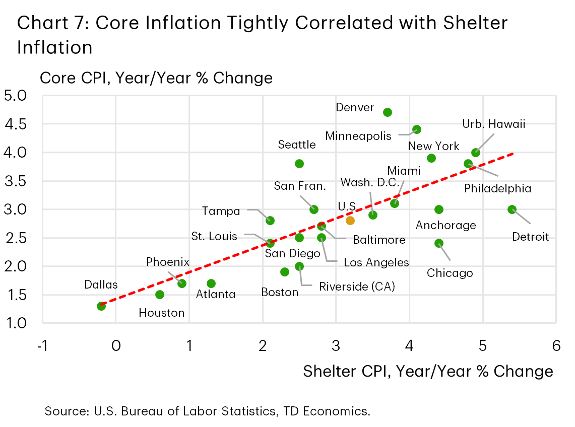
The recent data highlight this point. Shelter inflation is running near zero in Dallas and Houston, where housing and rental markets have cooled after a strong pandemic-era run (Chart 7). That is helping keep core inflation relatively low, even with energy prices moving higher. By contrast, New York – which was a relative underperformer earlier in the pandemic – is now seeing stronger shelter inflation, helping push core inflation above the national average. Other metros like Philadelphia and Urban Hawaii also stand out, with elevated shelter inflation contributing to much firmer core readings.
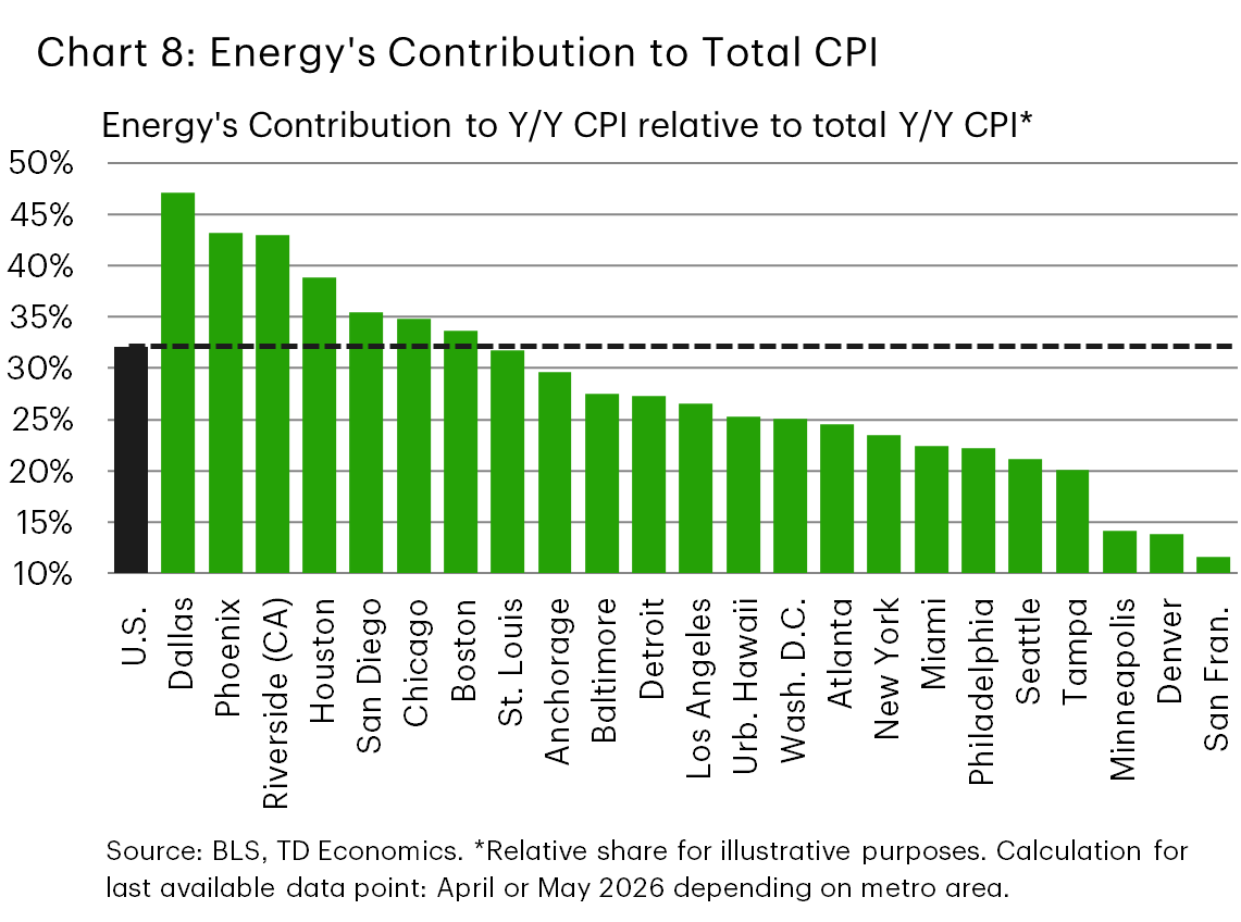
This shelter-driven divergence also matters for the outlook. Shelter inflation usually turns more gradually, while energy shocks can reverse quickly – as highlighted by the recent announcement of a U.S.–Iran “framework” peace deal, which has helped drive WTI oil prices down to around $70/barrel. We caution, however, that implementation risks still loom large for this latest peace deal, and further bouts of energy price volatility cannot be ruled out. Still, the key point is that for metros where the latest inflation rebound is mainly an energy story – such as Dallas, Phoenix, Riverside (CA), and Houston (Chart 8) – relief could arrive relatively quickly if fuel prices stabilize. On the other hand, for metros where shelter is still pushing core inflation higher, price pressures are likely to prove more persistent.
The real wage squeeze is back in several metros
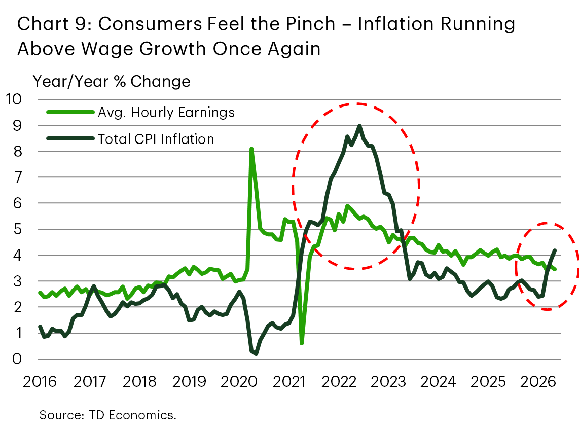
The renewed inflation pickup has arrived at a time when wage growth is no longer running as hot as it was earlier in the cycle. In May, national average hourly earnings rose by 3.6% y/y. With headline inflation at 4.2%, real wage growth has slipped back into negative territory for the first time since 2022. That marks an unwelcome echo of the early post-pandemic inflation shock, when wages were rising but not quickly enough to keep up with prices (Chart 9).
The metro-level picture is uneven. In several metros, wage growth is still comfortably outpacing inflation. These include Tampa, Houston, Miami, San Diego, San Francisco, Seattle and Atlanta, which are all seeing positive real wage growth, helped by either stronger wage gains, more moderate inflation, or a combination of both. From this point of view, consumers in these markets are generally better positioned to absorb the latest price shock, though households are still facing higher nominal costs.
The squeeze is more pronounced elsewhere. Denver, Minneapolis and Philadelphia show the largest real wage declines, reflecting a combination of elevated inflation and soft wage growth (Table 1). Inflation is estimated to be running ahead of wages in Detroit, St. Louis, Anchorage, and to a lesser extent Dallas. Meanwhile, in a handful of other metros, including Boston and Phoenix, real wage growth is close to flat, meaning households – while avoiding deterioration – are seeing little improvement in purchasing power.
This dynamic matters for consumer spending. Households can absorb temporary price shocks more easily when wages are rising quickly or at least keeping pace with inflation. But when inflation runs ahead of wage growth, the adjustment eventually shows up in spending behavior. Discretionary categories are usually most exposed, especially for lower- and middle-income households that devote a larger share of income to necessities such as fuel, utilities, food and rent. Consumers at the higher end of the income scale are generally less exposed, while strong stock market performance over the past year is likely providing an added cushion. Indeed, recent New York Fed survey evidence suggests lower-income households have already begun curbing discretionary outlays such as vacations, with spending intentions for non-essential categories more broadly also expected to remain weaker than for higher-income households.
The metro data point to the risk of a near-term discretionary spending squeeze across some local economies, even if national consumption growth remains decent. The good news is that this may be inflation’s latest high point. Our forecast calls for inflation, both headline and core, to ease gradually – a narrative especially likely if the latest Middle East peace deal is implemented quickly and has staying power (see our latest U.S. forecast here). This would help limit the squeeze for consumers and likely reduce the number of metros experiencing negative real wage growth over the near term.
Bottom Line
Energy prices have been the common catalyst behind the recent rise in inflation, pushing headline CPI higher across the country. Still, the intensity of the shock has differed, and headline inflation continues to run at very different speeds across metros – anywhere from below 3% y/y in some areas to around 5% in others.
Energy is only part of the story. Shelter remains a key driver of underlying inflation differences across metros. In places where shelter inflation has cooled, such as Dallas and Houston, core inflation remains relatively contained. Meanwhile, in metros where shelter costs are still rising quickly, including New York, Philadelphia and Urban Hawaii, core inflation is running hotter.
These metro-level inflation differences matter because they shape how much pressure households are feeling — and where consumer spending may be most exposed. With inflation once again running ahead of wage growth in a third of the large metros examined in this report, and real wage gains close to flat in a few others, metros facing the largest real-income squeeze are at greater risk of a slowdown in discretionary spending, even if aggregate consumption data continue to hold up. The good news is that with inflation expected to cool ahead, alongside an expected improvement in the labor market, there is scope for these pressures to ease in the quarters ahead. This outlook, however, assumes a continued gradual pull-back in energy prices. Any renewed volatility in global oil markets would risk delaying inflation relief in energy-sensitive metros, while inflation pressures are likely to remain more persistent in metros where shelter remains the primary driver.
Tables
Table 1: One Third of Metros Estimated to Be Experiencing Negative Real Wage Growth
| Inflation (Last Reading) |
Wage Growth Y/Y % Chg. (3-mma) | Wage Growth Minus Inflation | |
| U.S. | 4.2 | 3.6 | -0.7 |
| Anchorage | 4.3 | 2.7 | -1.6 |
| Atlanta | 2.9 | 5.2 | 2.3 |
| Baltimore | 3.6 | 4.9 | 1.3 |
| Boston | 3.2 | 3.6 | 0.4 |
| Chicago | 3.7 | 4.3 | 0.5 |
| Dallas | 2.6 | 2.4 | -0.2 |
| Denver | 5.0 | 0.7 | -4.3 |
| Detroit | 4.1 | 2.3 | -1.8 |
| Urban Hawaii | 5.1 | 6.4 | 1.3 |
| Houston | 2.8 | 6.4 | 3.5 |
| Los Angeles | 3.6 | 4.8 | 1.2 |
| Miami | 3.8 | 7.3 | 3.5 |
| Minneapolis | 4.7 | 0.5 | -4.2 |
| New York | 5.1 | 5.7 | 0.6 |
| Philadelphia | 4.8 | 1.8 | -3.0 |
| Phoenix | 3.0 | 3.3 | 0.2 |
| Riverside, CA | 3.4 | 5.4 | 2.0 |
| San Fran. | 3.8 | 6.7 | 2.9 |
| San Diego | 3.8 | 6.8 | 3.1 |
| Seattle | 4.9 | 7.4 | 2.4 |
| St. Louis | 3.5 | 1.8 | -1.7 |
| Tampa | 3.2 | 6.9 | 3.6 |
| Wash. D.C. | 4.1 | 4.9 | 0.8 |
Disclaimer
This report is provided by TD Economics. It is for informational and educational purposes only as of the date of writing, and may not be appropriate for other purposes. The views and opinions expressed may change at any time based on market or other conditions and may not come to pass. This material is not intended to be relied upon as investment advice or recommendations, does not constitute a solicitation to buy or sell securities and should not be considered specific legal, investment or tax advice. The report does not provide material information about the business and affairs of TD Bank Group and the members of TD Economics are not spokespersons for TD Bank Group with respect to its business and affairs. The information contained in this report has been drawn from sources believed to be reliable, but is not guaranteed to be accurate or complete. This report contains economic analysis and views, including about future economic and financial markets performance. These are based on certain assumptions and other factors, and are subject to inherent risks and uncertainties. The actual outcome may be materially different. The Toronto-Dominion Bank and its affiliates and related entities that comprise the TD Bank Group are not liable for any errors or omissions in the information, analysis or views contained in this report, or for any loss or damage suffered.
Download
Share this: