Highlights
- While there has been tremendous focus on the path of overall headline inflation and where it may be headed, much less has been said about its distributional impact.
- Given the differences in spending patterns among different income groups and age cohorts, one would expect rising prices to affect each differently.
- We find that middle income earners as well as the youngest demographic are those most significantly impacted by rising prices, as their consumption patterns tend to favor items that have experienced above average price gains in recent times.
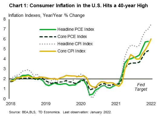
As the U.S. recovers from the health and economic toll imposed by the COVID-19 pandemic, inflation has become a more prominent feature of the recovery. As measured by the Consumer Price Index (CPI), inflation ran at only 1.4% year-over-year (y/y) in December 2020, comfortably below the Central Bank’s 2% target. However, inflation increased rapidly during 2021, with the U.S. now leading the pack among G7 nations (see report). As of January 2022, year-over-year inflation stood at 7.5% - the highest it has been in 40 years. Movements in other inflation measures have shown equally steep increases (Chart 1).
Much of the discussion around rapidly rising inflation has centered around the causes of it, contributors to it, ways to contain it and whether it is transitory or permanent. However, there has been relatively little ink spilt around its distributional impact. While the headline rate is indicative of price increases faced by the average American consumer, differences in spending habits necessarily mean that different demographic groups will experience rising prices differently. In this note, we briefly examine how the inflation experience of American households has been influenced by their age cohort and income group.
Rising Inflation is Evident Across Several Categories
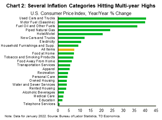
Key components in the CPI basket have experienced price surges similar to or even greater than those observed in the overall measure (Chart 2). Most notable is the energy component. The energy index rose by 27% between January 2021 and January 2022, or roughly four times total CPI. This reflected large increases in the energy commodities component (up 39.9%), with both fuel oil and gasoline posting increases of over 40%. While food inflation appears to be a more modest 7% year-over-year, this is the highest level of food inflation seen in over four decades. You would have to go back to August 1981 to find food inflation rates that high. Transportation costs have also been highly elevated over the year, due to sharp increases in both new (up 12.2%) and used (up 40.5%) motor vehicle prices.
Estimating Inflation by Income and Age
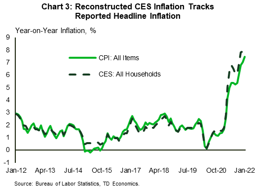
Since there is no way to directly extract consumption baskets across the various socioeconomic groups, one must do so indirectly. For this, we used the most recently available spending data from the 2020 Consumer Expenditure Survey (CES) – which does provide spending estimates by income level and age group. These expenditure categories were then mapped to the equivalent inflation categories in the CPI basket. Using the spending category weights and annual inflation rates for the same categories in the CPI, we were then able to construct inflation measures for each group as well as for all households.
The mapping exercise is not perfect, since the CES and CPI have some differences in spending categories. Still, the all-household inflation measure as calculated under the CES tracks closely with reported CPI headline inflation. For January 2022 the measure yielded an inflation rate of 8.4% versus reported headline inflation of 7.5% (Chart 3).
Income and Inflation During the Pandemic: It’s Hot in the Middle…
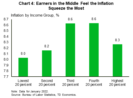
Based on our calculations, the inflation rate faced by middle-income earners has been higher relative to other groups, though the differences are not dramatic (Chart 4). Higher inflation for those in the middle part of the income spectrum reflects a greater share of used vehicles and gasoline in their consumption basket, which have been experiencing some of the highest rates of inflation. Collectively, they have contributed 3.5 percentage points (ppts) to the 8.6% y/y overall inflation reading experienced by income earners in the middle. In other words, about 40% of middle-income inflation was attributable to just these two categories, which account for a combined 8.72% of their spending basket. This compares to 6.98% for the lowest quintile and 7.06% for the highest.
… But Still Tight on the Lower End of The Income Scale
Inflation has been a little less rapid within the lower two income groups as those individuals direct a smaller share of expenditure to vehicle-related purchases (and operation) relative to other groups and it is these categories that have been experiencing scorching hot inflation. Notwithstanding this, some categories which have relatively large expenditure share by the lowest income quintile also saw notable inflation in January. These included natural gas, electricity and food at home.
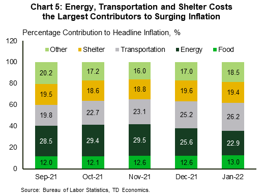
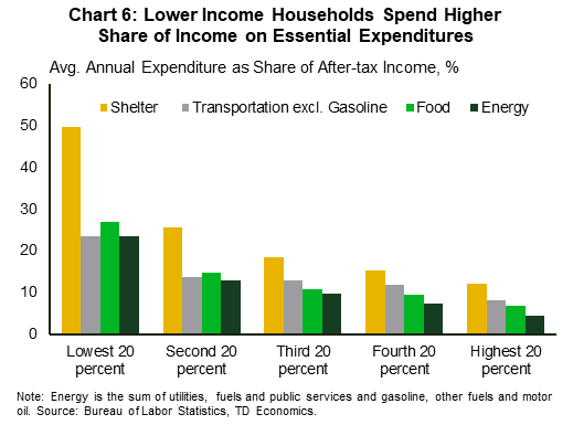
In January, increases in energy, transportation, shelter and food were the largest contributors to the 7.5% annual increase in total CPI (Chart 5). Not surprisingly, given the essential nature of many items within these categories, they account for a sizeable portion of consumption among lower income groups (Chart 6). In fact, for the lowest 40% of income earners, expenditure on these categories account for approximately 84% of after-tax income versus only 32% for the highest income quintile. As such, this leaves lower income groups little room for expenditure switching to avoid rising prices. Higher income households, however, do have the ability to adjust expenditure to better navigate steeply rising prices. So, while the inflation rate for lower income groups might be slower than that for their higher earning counterparts – and recent wage gains somewhat faster – their actual inflation experience is likely to be more acute as they have much less ability to absorb even small shocks to purchasing power. Additionally, they tend to spend all of their income, as opposed to higher earning income groups who have more discretionary income for saving and sizeable net assets.
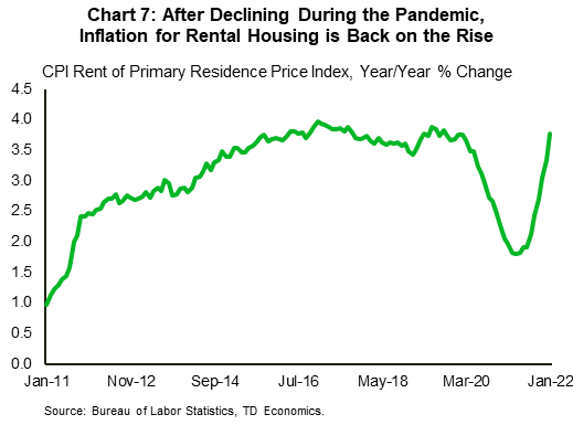
The notable rise in rental costs throughout 2021 (Chart 7) is particularly relevant to low-income households as well since a larger share of them are renters relative to higher income groups (52% vs 13%). Rented housing, where inflation has been picking up speed in the last few months, though still notably below the all-item average, accounted for 16% of this group’s expenditure – the largest expenditure share among all income groups. Additionally, given that those in the bottom 20% spend approximately half of their income on shelter1 , most of which goes towards paying rent, the effects of rising rental costs would be more acutely felt among this group. Rent is an area that is likely to see continued sustained upward pressure in the coming months considering the record-breaking increases experienced in home prices in 2021, and the lagged relationship between the two variables. Similarly, with respect to natural gas, low earners spend relatively more on this sub-component of the energy index than high earners. Consequently, the surging cost here is having a greater impact on those who earn the least.
Categories on which the highest income earners tend to spend more than other groups recorded relatively lower rates of inflation. These included education and recreation. Hotel/motels is the only category where this group has a larger expenditure share relative to the other groups which has experienced above-average inflation.
Younger Age Groups More Severely Impacted by Current Inflation Wave
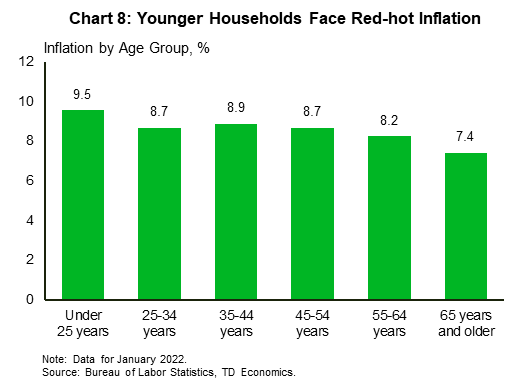
With respect to the age distribution, some of the most extreme price gains have occurred in categories which make up a larger share of the consumption baskets of younger persons relative to older generations. When it comes to inflation, those under 25 have seen the fastest increase in prices over the past year (Chart 8). This is largely due to greater spending in categories in the high-inflation areas of used cars and gasoline.
Similarly, younger people are more likely to be renters (83% of those under 25 were renters). This leaves them more vulnerable to the recent notable uptick in rental prices compared to older generations, who are more likely to be homeowners (only 20% of those over 65 were renters).2
The younger demographic’s vehicle purchase habits, as they often buy used cars, also means that they have faced significant price increases, given that used-vehicle prices are up 40.5% over the past year. Older adults (those over 65) are more likely to buy new cars, where price increases – though still rapid – have lagged behind their used-car counterparts.
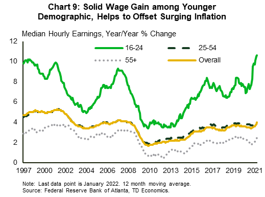
Those under 25, however, were able to breathe easier with respect to one of their major expenditure categories – education – which has seen much more muted price increases over the year. Also helping to ease some of the pain, has been steady wage gains among this demographic. Of note, the wage gain has not only exceeded that for other age groups but has also surpassed CPI headline inflation as employers vie for talent in a tight labor market (Chart 9).
Bottom Line
Inflation has emerged as a prominent characteristic of the post-covid recovery. Supply chain bottlenecks, roaring consumer demand for goods and a limited supply of workers have intertwined to overwhelm production, resulting in soaring prices across a broad spectrum of goods and services. The phenomenon is challenging to economic prosperity in the best of times and even more so in times of uncertainty. Inflation’s effects can also be uneven, as the expenditure characteristics of individuals and households vary greatly. As such, the distributional impact of these price increases is not borne equally by all consumers.
While no group has been able to avoid this period of high inflation, middle-income households and younger consumers have been experiencing the loftiest rates over the past year. Given the further surge in energy and food commodity prices so far in March, these recent impacts are likely to be amplified in the near-term.
End Notes
- Shelter accounts for a much greater share of income vs expenditure for this group as their expenditure accounts for other sources of revenue besides income, such as, government transfers and credit.
- Homeownership rate steadily increases with age.
Disclaimer
This report is provided by TD Economics. It is for informational and educational purposes only as of the date of writing, and may not be appropriate for other purposes. The views and opinions expressed may change at any time based on market or other conditions and may not come to pass. This material is not intended to be relied upon as investment advice or recommendations, does not constitute a solicitation to buy or sell securities and should not be considered specific legal, investment or tax advice. The report does not provide material information about the business and affairs of TD Bank Group and the members of TD Economics are not spokespersons for TD Bank Group with respect to its business and affairs. The information contained in this report has been drawn from sources believed to be reliable, but is not guaranteed to be accurate or complete. This report contains economic analysis and views, including about future economic and financial markets performance. These are based on certain assumptions and other factors, and are subject to inherent risks and uncertainties. The actual outcome may be materially different. The Toronto-Dominion Bank and its affiliates and related entities that comprise the TD Bank Group are not liable for any errors or omissions in the information, analysis or views contained in this report, or for any loss or damage suffered.
Download
Share: