Long-Standing Suburbanization Trend is Likely to Continue – An East Coast Update
Admir Kolaj, Economist | 416-944-6318
Date Published: October 28, 2021
- Category:
- US
- Real Estate
- Labor
- State & Local Analysis
Highlights
- The pandemic provided an added fillip to the long-standing suburbanization trend last year, as Americans (many of whom transitioned to working remotely) set their sights on the suburbs in search of more living space. Large metro areas along the East Coast mirrored this trend, with suburban population growth further widening its outperformance gap vis-à-vis urban cores across most metros.
- Last year's population estimates pertain to July 1st 2020, capturing only the first leg of the pandemic. A lot has happened since then. Signals from housing and labor market data suggest that, more recently, the underperformance of urban cores has abated to some degree, alongside improving public health conditions and the ongoing economic recovery. This trend has more room to run as the pandemic moves further into the rearview mirror. But instead of an urban revival, the theme here is likely to be one of gaining back some of the lost luster vis-à-vis suburbs.
- Despite expectations for bruised urban cores, such as those of Boston and New York, to claw back some lost ground, it appears that the suburban population growth advantage is likely to continue over the medium term as several factors continue to weigh in favor of suburbs. These include demographic tailwinds (i.e., the fact that millennials are increasingly entering the family-forming stage and their homebuying years with preferences tilted toward single-family homes and the suburbs) and the lingering popularity of remote work post-pandemic. The fact that homebuilders have generally been placing a greater focus on suburbs should be yet an added supportive element.
The world economy may have come to a screeching halt as the pandemic took hold last year, but that didn’t stop Americans from moving – whether to a different part of the country or nearby. If anything, the health crisis and the accompanying economic hardships were added reasons for some to relocate. In this vein, a Pew Research survey notes that earlier into the pandemic, risks of contracting COVID-19 were cited as a dominant factor for those moving out of dense urban areas, where perceived risks of contracting the disease may have been higher. But, through the tail end of 2020, as the crisis dragged on, financial distress became a more likely reason for moving.1
Warmer sunbelt markets remained a popular destination for those relocating out of state. That said, the vast majority of people that moved stayed in the same metro area.2 The move to the suburbs in search of more living space and perhaps a home office, was quite popular. This gave the long-standing suburbanization trend another shot in the arm last year.
Large East Coast metros areas were not immune to these trends. Suburban population growth continued to outpace urban population growth in all but one of the large thirteen East Coast metros examined in this report. More importantly, the outperformance gap between suburban and urban population growth widened last year across most metros.
Yearly Census Bureau population estimates are for a specific point in time (i.e., rather than an average for year). Last year's estimate pertains to July 1st, 2020, capturing only the first stage of the pandemic. The key question now is what has happened since then and what is likely to happen from here on out. Several related indicators in the labor market and housing realm suggest that the urban exodus for some of the most impacted Northeast metros has since abated thanks to an improving public health backdrop. While this trend may have more room to run, as the dust settles on the pandemic disruption, suburbs across large East Coast metros are likely to continue maintaining an edge over urban cores in terms of population growth, helped along by demographic tailwinds and the lingering popularity of remote work.
East Coast metros continue to mirror national suburbanization trend
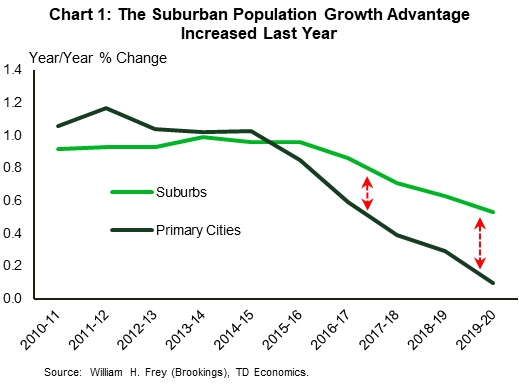
The population shift from highly urbanized areas to less-denser suburban areas has been ongoing for many decades in the United States. After a brief hiatus during the Great Recession, the trend has made a comeback over the past several years. An examination of last year's data confirms that the shift to the suburbs accelerated during the first leg of the pandemic. Indeed, while population growth slowed in 2020, both for primary cities and suburbs, a Brookings Institution report shows that the slowdown was much more pronounced for primary cities, with the suburban growth advantage increasing as a result (Chart 1).
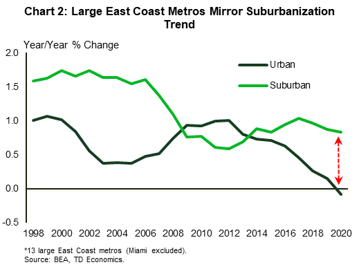
In a similar analysis that we did in 2018, where we examined urban/suburban population patterns across the largest East Coast metro areas, revealed that the region exhibited similar trends to the nation.3 Refreshing the numbers with more recent data, reveals not only an extension of the suburbanization trend in the first leg of the pandemic, but also an intensification of it across most of the thirteen metros examined in this report. Combined population growth across the East Coast's largest urban cores dipped into shallow negative territory last year. Suburban population growth, meanwhile, remained largely unperturbed at around 1%, thereby increasing its edge over urban cores (Chart 2).Southeast metros continue to hold a clear edge over Northeast metros
The urban/suburban population growth rates exhibited in Chart 2 are skewed downward by the weightier and slower-growing Northeast metros. Two metropolitan statistical areas stand out in particular: New York and Boston. Population growth in the New York metro's urban core – once the pandemic's epicenter in the U.S. – dipped further into negative territory last year (-0.6%). Meanwhile, Boston's highly urbanized core shrank for the first time in over a decade. An outflow of residents to nearby suburbs in search of more space and to warmer southern states, along with the lack of more typical immigration inflows, are all factors that likely contributed to these declines. By comparison, population growth in the southern metros, many of which continued to benefit from an inflow of residents from other parts of the country, generally held up much better.
Table 1: Population Growth in Largest East Coast Metropolitan Areas*
| Metro Area | 2004 | 2005 | 2006 | 2007 | 2008 | 2009 | 2010 | 2011 | 2012 | 2013 | 2014 | 2015 | 2016 | 2017 | 2018 | 2019 | 2020 | |
| Boston-Cambridge-Newton, MA-NH | Urban | -0.4 | -0.3 | 0.1 | 0.5 | 0.9 | 1.1 | 1.0 | 1.1 | 1.2 | 1.1 | 1.0 | 0.7 | 0.7 | 0.7 | 0.3 | 0.2 | -0.1 |
| Suburban | 0.3 | 0.5 | 0.5 | 0.4 | 0.4 | 0.3 | 0.4 | 0.5 | 0.4 | 0.5 | 0.8 | 0.5 | 0.7 | 0.8 | 0.5 | 0.5 | 0.5 | |
| Difference | -0.7 | -0.8 | -0.4 | 0.1 | 0.5 | 0.8 | 0.6 | 0.6 | 0.7 | 0.6 | 0.2 | 0.2 | 0.0 | -0.1 | -0.1 | -0.3 | -0.5 | |
| Providence-Warwick, RI-MA | Urban | 0.4 | -0.6 | -0.6 | -0.4 | -0.2 | -0.3 | 0.2 | 0.2 | 0.3 | 0.1 | 0.1 | 0.2 | 0.1 | -0.1 | 0.4 | -0.1 | -0.1 |
| Suburban | 0.0 | -0.4 | -0.2 | -0.3 | 0.0 | 0.2 | 0.1 | -0.1 | 0.1 | 0.2 | 0.3 | 0.1 | 0.1 | 0.3 | 0.4 | 0.0 | 0.1 | |
| Difference | 0.4 | -0.2 | -0.4 | -0.1 | -0.3 | -0.5 | 0.1 | 0.3 | 0.2 | -0.1 | -0.1 | 0.1 | 0.0 | -0.4 | 0.0 | 0.0 | -0.2 | |
| New York-Newark-Jersey City, NY-NJ-PA | Urban | 0.0 | -0.2 | -0.2 | 0.2 | 0.6 | 0.7 | 0.7 | 0.7 | 0.6 | 0.4 | 0.3 | 0.2 | 0.1 | -0.1 | -0.2 | -0.3 | -0.6 |
| Suburban | 0.2 | 0.1 | -0.1 | 0.2 | 0.4 | 0.5 | 0.4 | 0.3 | 0.1 | 0.1 | 0.1 | 0.1 | 0.0 | 0.2 | 0.0 | -0.1 | -0.2 | |
| Difference | -0.3 | -0.4 | -0.1 | 0.0 | 0.2 | 0.2 | 0.3 | 0.4 | 0.5 | 0.3 | 0.2 | 0.2 | 0.1 | -0.4 | -0.2 | -0.2 | -0.4 | |
| Philadelphia-Camden-Wilmington, PA-NJ-DE-MD | Urban | 0.2 | 0.2 | 0.2 | 0.3 | 0.4 | 0.7 | 0.5 | 0.5 | 0.5 | 0.3 | 0.3 | 0.2 | 0.2 | 0.2 | 0.3 | 0.1 | 0.0 |
| Suburban | 1.2 | 0.9 | 1.0 | 0.6 | 0.5 | 0.4 | 0.4 | 0.3 | 0.1 | 0.0 | 0.3 | 0.0 | 0.0 | 0.1 | 0.2 | 0.2 | 0.2 | |
| Difference | -1.0 | -0.7 | -0.9 | -0.3 | -0.1 | 0.2 | 0.1 | 0.2 | 0.4 | 0.3 | 0.0 | 0.2 | 0.2 | 0.1 | 0.1 | -0.1 | -0.2 | |
| Pittsburgh, PA | Urban | -0.9 | -1.0 | -0.7 | -0.3 | -0.1 | 0.1 | 0.1 | 0.4 | 0.2 | 0.2 | 0.0 | -0.3 | -0.2 | -0.5 | -0.2 | -0.1 | -0.4 |
| Suburban | -0.1 | -0.2 | -0.1 | -0.1 | -0.1 | -0.2 | 0.0 | -0.1 | -0.2 | -0.3 | -0.3 | -0.4 | -0.4 | -0.4 | -0.3 | -0.4 | -0.4 | |
| Difference | -0.8 | -0.9 | -0.6 | -0.1 | -0.1 | 0.3 | 0.2 | 0.4 | 0.4 | 0.5 | 0.2 | 0.0 | 0.2 | -0.1 | 0.1 | 0.2 | 0.0 | |
| Baltimore-Columbia-Towson, MD | Urban | -0.8 | -0.4 | -0.1 | -0.1 | 0.0 | 0.1 | 0.1 | -0.1 | 0.4 | -0.1 | 0.2 | -0.2 | -1.0 | -0.9 | -1.2 | -1.4 | -1.4 |
| Suburban | 1.1 | 0.8 | 0.7 | 0.5 | 0.6 | 0.8 | 0.9 | 0.9 | 0.9 | 0.7 | 0.5 | 0.5 | 0.5 | 0.5 | 0.5 | 0.4 | 0.2 | |
| Difference | -1.8 | -1.2 | -0.8 | -0.6 | -0.6 | -0.7 | -0.9 | -1.0 | -0.5 | -0.7 | -0.3 | -0.7 | -1.5 | -1.4 | -1.7 | -1.9 | -1.6 | |
| Washington-Arlington-Alexandria, DC-VA-MD-WV | Urban | 0.8 | 0.8 | 0.4 | 0.7 | 1.2 | 2.0 | 2.1 | 1.9 | 1.7 | 1.4 | 1.0 | 1.0 | 0.7 | 0.8 | 0.3 | 0.3 | 0.2 |
| Suburban | 3.8 | 3.5 | 2.6 | 2.1 | 1.8 | 1.5 | 2.0 | 1.8 | 1.5 | 1.7 | 1.8 | 1.3 | 1.6 | 1.8 | 1.6 | 1.7 | 1.3 | |
| Difference | -3.0 | -2.7 | -2.2 | -1.5 | -0.5 | 0.5 | 0.1 | 0.1 | 0.2 | -0.4 | -0.9 | -0.3 | -0.8 | -1.0 | -1.3 | -1.3 | -1.2 | |
| Virginia Beach-Norfolk-Newport News, VA-NC | Urban | 1.1 | -0.4 | 0.6 | -0.7 | -0.5 | 0.1 | 0.4 | 0.3 | 0.6 | 0.3 | 0.2 | 0.0 | -0.2 | -0.3 | -0.2 | 0.0 | 0.0 |
| Suburban | 2.7 | 2.2 | 1.9 | 1.1 | 0.9 | 0.9 | 1.2 | 0.5 | 0.7 | 0.7 | 1.2 | 0.9 | 0.9 | 1.0 | 0.9 | 1.0 | 0.9 | |
| Difference | -1.6 | -2.6 | -1.4 | -1.8 | -1.4 | -0.8 | -0.7 | -0.2 | -0.1 | -0.4 | -1.0 | -0.9 | -1.1 | -1.3 | -1.0 | -1.0 | -0.9 | |
| Charlotte-Concord-Gastonia, NC-SC | Urban | 2.5 | 3.3 | 4.1 | 3.7 | 3.0 | 2.3 | 1.6 | 2.2 | 2.5 | 2.5 | 2.0 | 2.3 | 2.3 | 2.0 | 1.5 | 1.6 | 1.4 |
| Suburban | 1.8 | 2.5 | 3.6 | 3.8 | 3.2 | 1.8 | 1.0 | 0.8 | 1.1 | 1.2 | 1.6 | 1.8 | 2.0 | 2.0 | 1.8 | 1.8 | 1.9 | |
| Difference | 0.7 | 0.8 | 0.5 | -0.2 | -0.2 | 0.5 | 0.6 | 1.4 | 1.4 | 1.2 | 0.3 | 0.5 | 0.3 | 0.0 | -0.3 | -0.2 | -0.5 | |
| Atlanta-Sandy Springs-Roswell, GA | Urban | 0.9 | 1.4 | 2.6 | 2.0 | 1.6 | 1.2 | 1.1 | 1.5 | 1.9 | 1.2 | 1.4 | 1.6 | 1.7 | 1.2 | 0.9 | 0.9 | 0.6 |
| Suburban | 3.9 | 4.3 | 4.8 | 4.1 | 2.9 | 1.6 | 1.2 | 0.7 | 0.7 | 1.3 | 1.7 | 1.7 | 2.0 | 2.0 | 1.9 | 1.9 | 1.8 | |
| Difference | -3.0 | -2.9 | -2.2 | -2.1 | -1.3 | -0.4 | -0.1 | 0.9 | 1.3 | -0.2 | -0.3 | -0.1 | -0.2 | -0.8 | -1.0 | -1.0 | -1.2 | |
| Jacksonville, FL | Urban | 1.3 | 1.1 | 1.6 | 1.1 | 0.5 | 0.5 | 0.7 | 0.8 | 0.9 | 0.7 | 1.2 | 1.6 | 1.7 | 1.3 | 1.2 | 1.0 | 0.7 |
| Suburban | 5.1 | 4.3 | 4.8 | 3.5 | 2.5 | 1.7 | 1.7 | 1.3 | 1.6 | 2.0 | 2.4 | 2.8 | 3.0 | 3.1 | 2.9 | 3.0 | 3.2 | |
| Difference | -3.8 | -3.2 | -3.2 | -2.5 | -2.0 | -1.2 | -1.0 | -0.5 | -0.7 | -1.3 | -1.2 | -1.2 | -1.3 | -1.8 | -1.7 | -2.0 | -2.5 | |
| Orlando-Kissimmee-Sanford, FL | Urban | 2.9 | 3.8 | 2.5 | 1.2 | 1.2 | 1.2 | 1.3 | 1.6 | 2.3 | 1.8 | 2.1 | 2.5 | 2.5 | 2.1 | 1.7 | 0.8 | 0.6 |
| Suburban | 6.1 | 5.2 | 5.6 | 3.9 | 2.2 | 1.0 | 1.2 | 2.1 | 2.3 | 2.5 | 3.2 | 3.6 | 3.7 | 3.8 | 3.6 | 2.3 | 2.7 | |
| Difference | -3.2 | -1.4 | -3.1 | -2.7 | -1.0 | 0.3 | 0.1 | -0.4 | -0.1 | -0.6 | -1.0 | -1.1 | -1.2 | -1.8 | -1.9 | -1.5 | -2.0 | |
| Tampa-St. Petersburg-Clearwater, FL | Urban | 1.6 | 1.8 | 1.1 | 0.3 | 0.5 | 0.8 | 1.0 | 1.1 | 1.3 | 1.4 | 1.6 | 1.9 | 2.0 | 1.7 | 1.3 | 1.0 | 0.9 |
| Suburban | 4.8 | 5.0 | 4.3 | 3.2 | 1.6 | 0.1 | 0.6 | 0.1 | 0.5 | 0.9 | 1.7 | 2.1 | 2.9 | 2.8 | 2.5 | 2.5 | 2.8 | |
| Difference | -3.2 | -3.3 | -3.2 | -2.9 | -1.2 | 0.6 | 0.3 | 1.0 | 0.8 | 0.5 | 0.0 | -0.3 | -0.9 | -1.1 | -1.2 | -1.6 | -1.9 | |
| Total (13 metros) | Urban | 0.4 | 0.4 | 0.5 | 0.5 | 0.7 | 0.9 | 0.9 | 1.0 | 1.0 | 0.8 | 0.7 | 0.7 | 0.6 | 0.5 | 0.3 | 0.2 | -0.1 |
| Suburban | 1.6 | 1.5 | 1.6 | 1.4 | 1.1 | 0.8 | 0.8 | 0.6 | 0.6 | 0.7 | 0.9 | 0.8 | 0.9 | 1.0 | 1.0 | 0.9 | 0.8 | |
| Difference | -1.3 | -1.2 | -1.1 | -0.9 | -0.4 | 0.2 | 0.2 | 0.4 | 0.4 | 0.1 | -0.2 | -0.1 | -0.3 | -0.6 | -0.7 | -0.7 | -0.9 | |
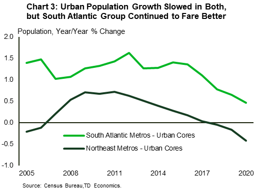
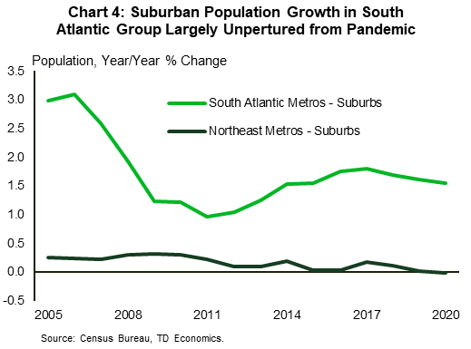
Grouping the Northeast metros from Boston to as far south as Pittsburgh and those further down the coast (Baltimore to Tampa) within the South Atlantic group, helps crystalize a clearer narrative. When it comes to highly urbanized areas, population growth slowed down in both, but while it dipped into negative territory in the typically slower-growing northern group, it held up much better in the southern group (Chart 3). On the other hand, suburban population growth saw little change in both last year, with the northern group recording no growth and the southern group continuing to grow at a healthy 1.6% (Chart 4). For a more detailed urban/suburban breakdown by specific metro area, see Table 1.
Urban decline in most Impacted Northeast metros has likely abated
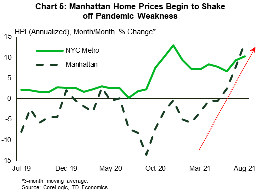
As mentioned earlier, 2020 population data pertain to July of last year, capturing only the first leg of the pandemic. A lot has happened in the fifteen months since then. Suburban population growth has likely continued to outpace urban population growth over the past year, helped along by the protracted health crisis and the increased comfort of workers and firms with remote work. That said, a look at data that tend to be aligned with population trends, such as housing and labor market data, suggests that the underperformance of urban cores has more recently abated to some degree, alongside the ongoing economic recovery. For instance, the strong absorption of apartment units across the region in recent quarters is a very positive signal. With apartments being snapped up at a fast clip, after a period of significant weakness in 2020, multifamily vacancy rates have declined and are now below their pre-pandemic level across all thirteen metros (Table 2). Tighter market conditions, meanwhile, have led to an acceleration in rent growth, which is running at a particularly fast (double-digit) clip across most South Atlantic metros. While these positive trends extend to the broader metro, multifamily units tend to be found in greater concentration in urban cores rather than the suburbs, pointing to a solid pickup in urban core population flows. The return of strong home price growth in counties that were inside the eye of the storm, such as Suffolk County in the Boston metro and Manhattan in New York, which recorded among the sharpest declines in population in their respective metros last year at, is an added positive signal (Chart 5). 4
Table 2: Absorption of Multifamily Units Heats Up
| Apt. Unit Absorption by Metro Index* (Q4-2019 = 100) | Dec-19 | Mar-20 | Jun-20 | Sep-20 | Dec-20 | Mar-21 | Jun-21 | Sep-21 | |
| Northeast | Boston - MA | 100 | 97 | 59 | 44 | 60 | 84 | 167 | 198 |
| Providence - RI | 100 | 81 | 89 | 117 | 168 | 199 | 173 | 169 | |
| New York - NY *" | 100 | 71 | 17 | 0 | 9 | 50 | 129 | 187 | |
| Philadelphia - PA | 100 | 100 | 87 | 101 | 124 | 148 | 195 | 221 | |
| Pittsburgh - PA | 100 | 81 | 38 | 16 | 21 | 42 | 110 | 174 | |
| South Atlantic | Baltimore - MD | 100 | 99 | 101 | 147 | 177 | 197 | 214 | 180 |
| Washington - DC | 100 | 93 | 59 | 30 | 27 | 53 | 122 | 181 | |
| Norfolk - VA | 100 | 89 | 131 | 201 | 245 | 269 | 238 | 171 | |
| Charlotte - NC | 100 | 98 | 86 | 98 | 105 | 120 | 154 | 175 | |
| Atlanta - GA | 100 | 100 | 102 | 152 | 188 | 234 | 281 | 252 | |
| Jacksonville - FL | 100 | 106 | 119 | 162 | 174 | 216 | 246 | 204 | |
| Orlando - FL | 100 | 94 | 63 | 77 | 95 | 155 | 269 | 310 | |
| Tampa - FL | 100 | 94 | 90 | 103 | 130 | 163 | 209 | 223 | |
| East Coast (13-metro total) | 100 | 91 | 66 | 71 | 87 | 120 | 180 | 205 | |
| United States | 100 | 94 | 82 | 98 | 115 | 149 | 204 | 222 | |
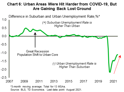
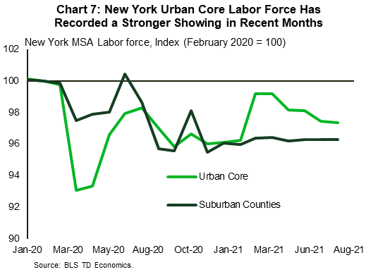
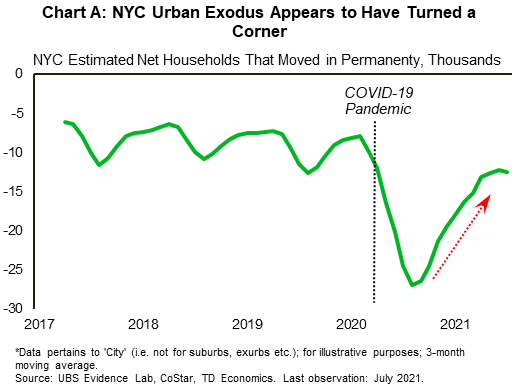
Labor market data also offer some support to this narrative. While employment in urban cores was hit harder at the onset of the pandemic – generally the opposite of what was observed during the Great Recession – these markets have been making up growth relative to their suburban counterparts in recent months. To be clear, suburban unemployment rates are still lower relative to those in urban regions across most metros, but that gap has been shrinking on a fairly consistent basis across the East, including in larger metros of Boston and New York (Chart 6).5 Signals from unemployment rate differentials may be more convoluted than those of the housing market, given the many ingredients that make up the unemployment rate (i.e. the willingness of workers to head back to the labor force, the availability of jobs etc.). In some cases, however, such as in New York, this narrative is also supported by a stronger relative showing of the urban core's labor force (Chart 7). Speaking of the Big Apple, alternative data tracking population shifts more directly also support the narrative that its urban exodus has abated (see Chart A in the appendix).
A continuation of the economic recovery and the return to normalcy alongside rising vaccination rates, should continue to lend a hand to badly bruised urban cores. But instead of an urban revival, the theme here is likely to be one of gaining back some of the lost luster vis-à-vis suburbs. A resumption of large-scale return-to-office plans, which were put on hold during the Delta-driven infection wave, should provide an added bump in the weeks and months ahead. At the same time, some of those that are required to work from the office at an increased capacity (i.e., more days per week than during the pandemic) will likely gravitate back toward urban cores to avoid long commutes.
Suburbs are likely to continue dominating over the medium term
Despite expectations for urban cores, such as those of New York or Boston, to claw back some lost ground, it appears likely that the suburban population growth advantage is likely to continue over the medium term, thanks in part to the lingering popularity of remote work and demographic tailwinds. The latter is related to millennials – an age group of particular importance given that it has been one of the biggest sources of population growth for suburbs along the East Coast over the last few years (Chart 8). Millennials should continue to offer additional support to suburban population growth in the years ahead, given that they are increasingly entering the family-forming stage and their homebuying years, with preferences tilted toward single-family homes and the suburbs. This age group continues to make up the largest share of homebuyers at around 37% nationwide, according to NAR.6 In addition, of the homes purchased by millennials recently, more than four in five are single-family homes.7

Research from the National Association of Home Builders (NAHB) confirms that the preference for detached homes, a staple of suburbia, applies not only to millennials but also the average buyer, with more than two thirds of those surveyed earlier this year preferring single-family homes.8 What's important is that the health crisis appears to have had an impact on housing preferences too, leading to an increase in the share of buyers that want larger homes (21%) as a result of the pandemic.9 Complementing this, location preferences have also shifted as a result of the pandemic, with survey data showing a notable increase in the share of buyers favoring properties in outlying suburbs.
The other piece to the puzzle is tied to the future of work. According to the same NAHB survey above, households where at least one family member works or studies remotely where even more likely to want a larger home as a result of the pandemic, at 35%. Both firms and employees are still in the process of figuring out what the future of work will look like over the long-term. Depending where the pendulum lands, this will have important implications for the urban/suburban divide. So far, survey data and company-specific decisions point to a fragmented picture. On the one hand, some firms are summoning their employees back to work, while others like LinkedIn, Twitter and Amazon will give many of their workers the option to work remotely on a full-time basis. Then there's the hybrid approach, with companies allowing workers to split time between in-person and remote work. This latter strategy, which may allow for greater flexibility, appears to be relatively popular, garnering the support of 50-75% of employees (depending on the survey). Whatever the individual path, one thing is for sure: remote work will take on a permanently higher share than it did pre-pandemic, even as the traditional office recaptures some activity. This trend is expected to continue working in favor of suburbs.
Builders have taken the cues from changing preferences on housing and work and are acting accordingly. A look at building permits issued across metros reveals that the suburbs have been grabbing a bigger share of the pie compared to the pre-pandemic period (Chart 9). Again, while there are some detractors here too, such as Philadelphia and Pittsburgh, the narrative holds for the vast majority of large East Coast metros examined in this report. An improved availability of housing inventory in the suburbs will help provide some offset against diminished affordability – a trend that has been more pronounced for single-family homes during the pandemic (Chart 10). Ultimately, a continuation of the homebuilding trend seen in chart 9 will mean that housing inventories should be yet an added element working in favor of suburbs from a population growth perspective.


Bottom line
The pandemic provided an added fillip last year to the long-standing suburbanization trend, as Americans set their sights on the suburbs in search of less denser living arrangements and more space for their home offices. Large metro areas along the East Coast mirrored this trend, with suburban population growth further widening its outperformance gap vis-à-vis urban cores across most metros.
More recently, positive signals from housing and labor market data suggest that the underperformance of urban cores has likely abated to some degree, alongside improving public health conditions the ongoing economic recovery. Badly bruised urban cores, such as those of Boston and New York, are expected to regain some of their lost luster as the pandemic wanes further. Despite this, the suburban population growth advantage is likely to continue over the medium term. This as demographic tailwinds and the lingering popularity of remote work continue to favor the shift to the suburbs.
Appendix
End Notes
- Pew Research Center, "As the pandemic persisted, financial pressures became a bigger factor in why Americans decided to move", Feb 2021, see here.
- Bloomberg CityLab, "More Americans Are Leaving Cities, But Don't Call It an Urban Exodus", April 2021, see here. Analysis reveals that most movers, about 84%, remained within the same metro area.
- Categorized counties as either urban or suburban based on Census Bureau measure on the share of the population living in urban areas (i.e., counties where more than 95% of the population lives in urban areas are classified as urban). For more detail see original report: "Back to the ‘Burbs – An East Coast Analysis", September 2018, here.
- The population of Suffolk County, MA fell 0.5% last year and the population of New York County, NY (Manhattan) fell 1.2%.
- There are some detractors to this broader trend; they include Pittsburgh, Orlando and Tampa. The suburban unemployment rate in these metros is actually higher than that of their respective urban cores, much as it was before the pandemic.
- NAR, "2021 Home Buyers and Sellers Generational Trends", see here and here.
- Ibid. According to NAR, detached single-family homes made up 81% of homes purchased by younger millennials (22-30) and 88% of older millennials (31-40).
- NAHB, "What Home Buyers Really Want", Mar 2021, see here.
- Ibid.
Disclaimer
This report is provided by TD Economics. It is for informational and educational purposes only as of the date of writing, and may not be appropriate for other purposes. The views and opinions expressed may change at any time based on market or other conditions and may not come to pass. This material is not intended to be relied upon as investment advice or recommendations, does not constitute a solicitation to buy or sell securities and should not be considered specific legal, investment or tax advice. The report does not provide material information about the business and affairs of TD Bank Group and the members of TD Economics are not spokespersons for TD Bank Group with respect to its business and affairs. The information contained in this report has been drawn from sources believed to be reliable, but is not guaranteed to be accurate or complete. This report contains economic analysis and views, including about future economic and financial markets performance. These are based on certain assumptions and other factors, and are subject to inherent risks and uncertainties. The actual outcome may be materially different. The Toronto-Dominion Bank and its affiliates and related entities that comprise the TD Bank Group are not liable for any errors or omissions in the information, analysis or views contained in this report, or for any loss or damage suffered.
Download
Share: