

Yes, the title of this presentation comes from a famous soap opera. It’s appropriate to depict the past year, full of economic and political drama. We’re on the cusp of closing out 2025, a dramatic 365 days marked by the shifting sands in government policies and corporate behaviors.
And this final quarter of the year has brought forward more pivots on both sides of the border that will keep us glued to the next episode. My only hope is that the economic drama doesn’t run sixty-three seasons like the soap opera!
There are three main messages to review:
- Globally the negative effects from the trade war have been muted relative to expectations, in part because countries show evidence of finding new markets or engaging in trade diversion. Canada falls into the first bucket.
- Even with the lack of U.S. economic data due to the government shutdown, tensions have re-surfaced on the K-shaped economy. This term was previously used to describe the pandemic, marked by not just the differing fortunes between income groups, but diverging forces.
- Never say never when it comes to Canada. The resilience of the job market has been the biggest surprise of the quarter, and now the Federal budget offers an opportunity for a potential tailwind.
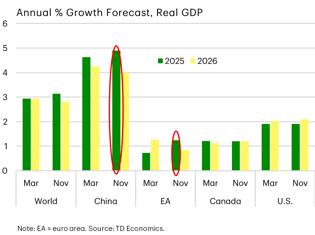
2025 Global Economy: Tariff Troubles Not Evident
Last quarter, I mentioned that the U.S. forecast hadn’t changed a whole lot despite the dramatic policy shifts throughout the year. That’s because of the many cross currents from lower interest rates, to the OBBB, to the negative impacts from tariffs calibrated against companies shielding consumers with inventory stockpiling and other behaviors.
This graph shows that it’s not just a US theme, but a global one.
Between the March forecast cycle and this month, there were few markdowns, and even some modest upgrades for regions like the E.U. and China. Many countries mobilized quickly on fiscal programs, like increased defense spending, or in China’s case, successfully finding new markets for their products.
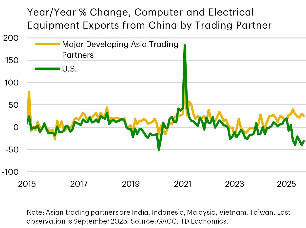
Trade Diversion: China Finding New Markets, And Canada Too
To that point, China’s most tech-exposed exports to the U.S. versus their Asian trading partners.
Once U.S. tariffs were threatened, trade immediately shifted to other markets, mitigating most of the negative impact to China’s aggregate exports. So far, it’s an impressive pivot and exactly what economic theory predicts would happen when a country has a strong comparative and competitive advantage in certain products.
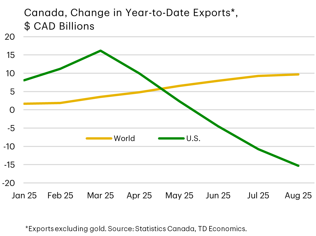
Canada is also succeeding in rotating its export markets. Although not as successful as China in fully offsetting the impacts, the speed of adjustment was certainly faster than many expected given the high trade dependence on the United States.
What and where are the next destinations?
- Oil exports are responsible for ~35% of the gain to other foreign markets (this excludes gold shipments and U.S. exports).
- Canada has increased exports to 27 partners by $6.6 billion.
- The biggest export swings have been to China, Denmark, Hong Kong, the Netherlands and Singapore.
- Although the dollar value hasn’t been enough to offset the decline to the U.S., which clocks in at $15 billion, it’s helped cushion the blow.
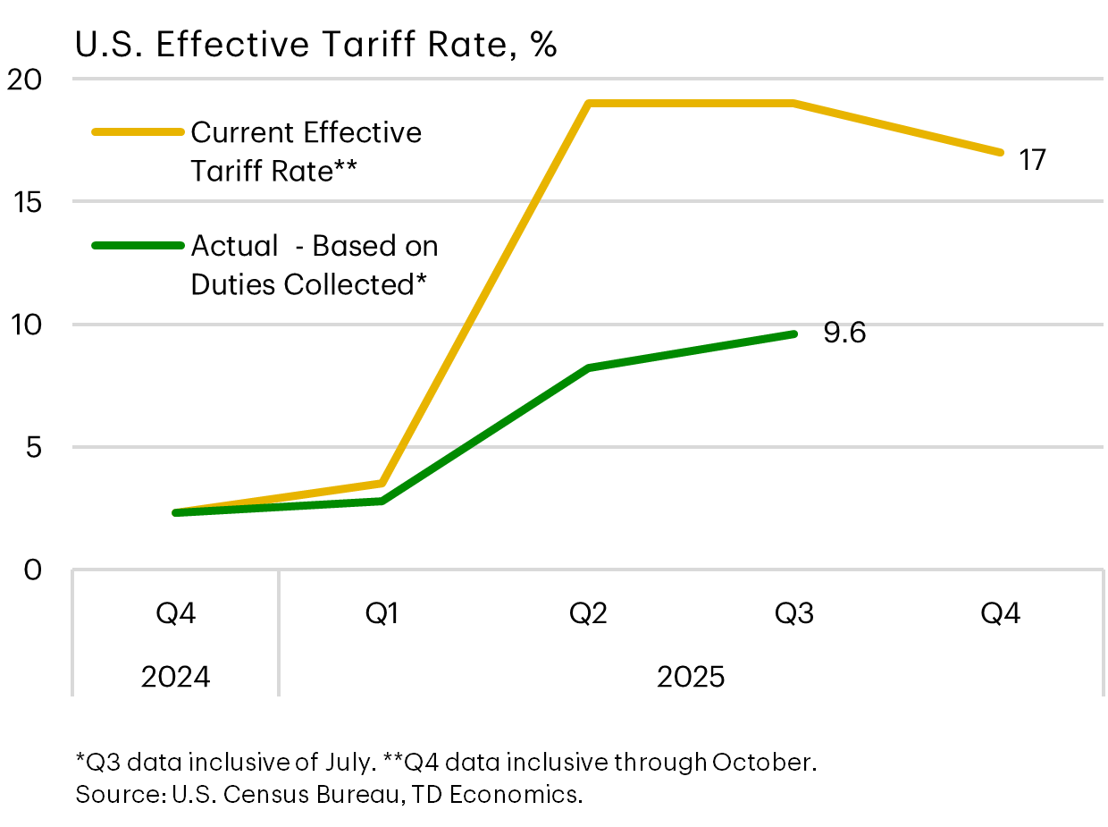
Tariffs Paid Not As High As The “Sticker Price”
The global impacts of the trade war are also mitigated by lower duties collected relative to what is prescribed in the President’s executive orders. In turn, this is shielding consumers from the full downstream impact on prices not just for the U.S., but globally.
A combination of factors are at play, from supply chain substitution, to the U.S. administration adjusting tariffs on imports deemed critical, to companies absorbing some of the tariffs in their margins.
So stating a tariff rate is one thing, but rapid and evolving behavioral adjustments are shielding the global economy from a sharper impact.
Central Bank Coordinated Rate-Cuts Lend A Helping Hand
And, of course, an improvement in financial conditions is also lending a helping hand, whether it’s in wealth creation from the stock market, a narrowing in credit spreads or lower interest rates.
At this point, we think the Bank of Canada is done on the interest cycle. It was out in front of most central banks in the speed and magnitude of decline, with 100 basis points occurring just this year under the trade war. With the policy rate at 2.25%, it’s already at the bottom end of the Bank of Canada’s neutral estimate.
That’s meaningful because Governor Macklem has repeatedly stated that monetary policy is limited in addressing the structural shift facing the economy. And at the last meeting, he was unusually prescriptive in forward guidance to note that economic growth would likely have to slip below their forecast, already very modest at just 1.1%, for them to react in 2026.
And now that the Federal government has stepped up to the plate with some big spends in capital investment, this takes some pressure off of the central bank to do the heavy lifting.
As for the Federal Reserve, our view hasn’t changed. We think they’re driving towards a resting place of 3.25% next year, but it might be in a stop-and-go manner given the data interruption from the government shutdown. So as a precaution, we pushed out the timing of hitting 3.25% to the third quarter, which also aligns to the new Fed Chair being in seat and likely wanting to put their own stamp on policy.
Who’s Left On The Wheel of Trade Fortunes? Canada and Mexico!
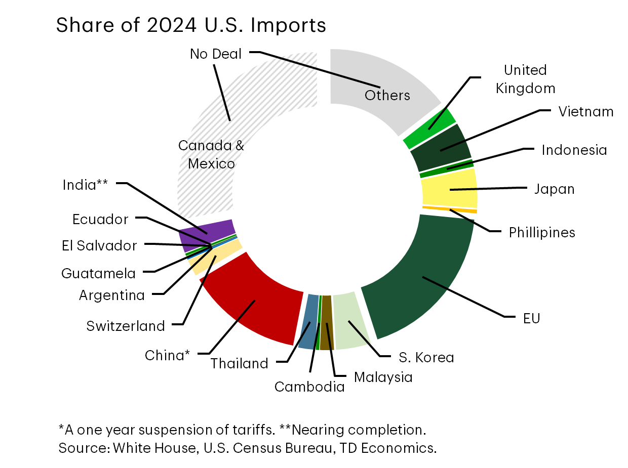
After a slow start to the year, trade deals were rapidly underway this quarter. Normally I’d say this provides more certainty to the business environment, but not as much as this donut graph leads us to believe.
First, since last quarter, the U.S. went from securing agreements with countries that covered 30% of their imports to today’s value of 60%. Canada and Mexico are the last remaining major trading blocks at 28% of U.S. imports.
Now, I’m using the words, “trade deal” liberally. Often details still need to be negotiated and the implementation process differs by country. Take the European-U.S. deal, which was announced in July, but requires E.U. parliamentary approval to remove tariffs and other barriers, such as limits to agricultural imports.
However, E.U. lawmakers are unlikely to vote before February and President Trump is already showing frustration and threatening retaliation. And the yardstick keeps moving. Recently, Commerce Secretary Lutnick indicated that lowering the tariff rate on steel and aluminum may require additional concessions on European rules for big tech companies.
So trade deals offer hope of stability, but are not yet creating that environment for businesses.
The text box is similar to what was shown last quarter on the common characteristics of the trade deals that Canada and Mexico will likely be facing. Nothing has changed except for item number four, where the China trade truce was placed at only a one-year timeframe, to be reviewed thereafter. This would certainly give Canadian businesses pause if CUSMA renegotiation in 2026 results in a higher review period frequency rather than the initial six-year cadence. If that were to happen, we would not anticipate a recovery in new business investment in Canada that’s oriented to serve the U.S. market.
Common Features in U.S. "Deals":
- 10-15% base tariff rate
+ removal of retaliatory tariffs
+ lower barriers to US companies (tariffs and regulation)
- Purchase agreements & Investment commitments
- (Some) Section 232 tariff relief
- New feature?
- Short timeframe on the tariff-truce (i.e. China)
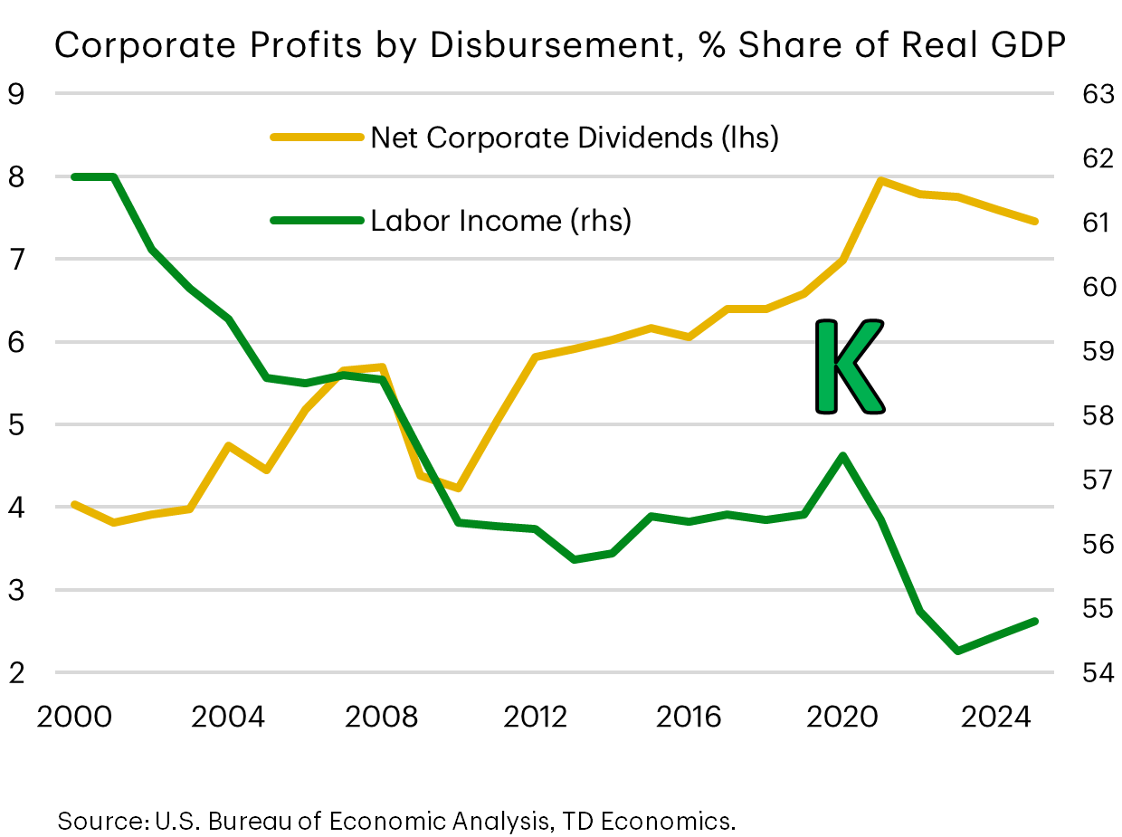
Why is The K-Economy Back In Focus For the United States?
With Trump’s team busy cutting trade deals, two other themes popped up this quarter with a focus exclusively on households. Discussions on the K-shaped economy became front-and-center, with data reinforcing the step down in the benefits flowing from the job market to the average household relative to the benefits derived from the corporate sector.
The second, and related theme, honed in on household affordability, which caused the Trump administration to pivot policies to get in front of criticism that insufficient progress had been made on campaign promises to improve living costs. Both will be reviewed in more detail with the next few graphs.
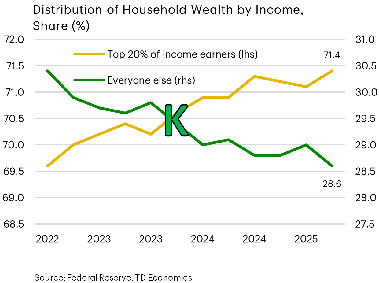
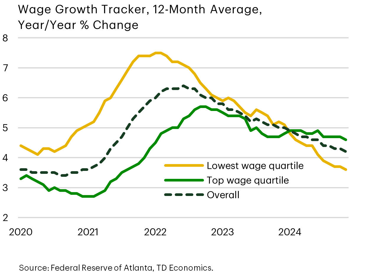
Wealth Concentration Deepens Among Higher Income Households
The distribution of household wealth across income earners is a perfect example of the differing and diverging trends that encapsulate a K-shaped economy. It’s not a new story that the wealth-pie grows for the top 20% of income earners. But it now has the attention of Trump’s administration after election campaigns focused on the cost of living by Democrats put up decisive wins, from Mamdani in NYC to dominant Democrat wins in Virginia and NJ relative to pollster expectations.
Why? The incredible gains in the stock market this year tend to advantage the top 20% of income earners, where financial assets represent just over 80% of their total wealth compared to 66% for the remaining households. And the high U.S. interest rate environment risks further widening the disparity between lower- and higher-income groups. High-income households maintain greater savings, allowing them to benefit from elevated rates, whereas lower- and middle-income households tend to face increased borrowing and debt-servicing costs.
Lastly, because lower- and middle-income households derive most of their income from employment, the deceleration in job demand is compressing wages more rapidly for this group, building on the tension within this debate.
The White House Message: Lower Prices, Bigger Paychecks
Enter the Trump-team’s strategic pivot.
First attempts to convince Americans that prices were falling and their paychecks were outpacing the cost of living proved tone-deaf. The contents of the box below is pulled from the White House page.
The media leaned into criticism of the administration’s use of the Breakfast Basic Index referenced by DoorDash. Although I’m a fan of avocados, it’s a less conventional choice for the every day American family. And even for those who consume them regularly, there would be less excitement over a 9 cent drop in avocados relative to a $4 dollar increase in ground beef from the prior year, which makes up a larger share of their weekly grocery bill.
And the last point made on wage growth outpacing restaurant price increases is a narrow lens relative to the day-to-day expenses of households.
White House Message:
President Trump has tamed inflation
- The Breakfast Basics Index — three eggs, a glass of milk, a bagel, and an avocado — decreased 14% between March and September and 1.7% over the past year.
- The Everyday Essentials Index — toothpaste, shampoo, toilet paper, laundry detergent, pain medicine, and diapers — fell over the past year.
Americans are beginning to see price declines
- Over the past year, prices actually declined for cheese, cereals & bars, fresh fruits, frozen meals, packaged meals, condiments, batteries, computers & accessories, phones & accessories, medicines, oral care, vitamins & supplements, outdoor products, and toys & games.
President Trump’s policies are fueling wage growth
- Nationally, wage growth is outpacing restaurant price increases — including at the city level in half of the cities studied.
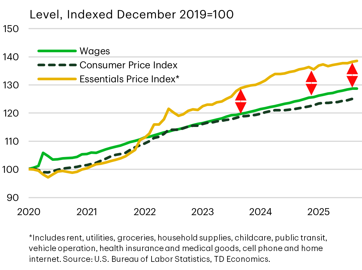
Inflation Feels Higher – Wages Not Keeping Up With Essentials
To address this, we created an “essential price index” that’s more representative of the average American experience in areas where they have little choice on substitution or avoiding payments. These include rent, utilities, childcare, public transit, and so forth…captured in the list footnoted in the graph.
Graphing the level of that index relative to wages shows there’s been zero compression between these metrics. The red arrows are all the same height since the end 2023, pushing against repeated promises since the campaign trail to end inflation and bring down the prices of all goods.
For an economist, that was never a realistic promise but obviously had popular appeal. Now, with nearly a year under the Administration’s belt and with mid-term elections coming into scope, perceptions of poor affordability is public enemy #1 now for Republicans.
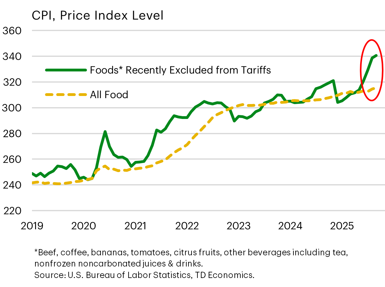
Policy Shift #1 – Tariffs Removed On 200+ Food Items
So on November 14, the Administration announced the removal of reciprocal tariffs on a list of over 200 food products imported into the United States. We created a price index of those items to show the acceleration and why their messaging wasn’t landing for main street households.
Had President Trump not removed tariffs from these items, the picture would have worsened into 2026 because the full scope of reciprocal tariffs only took effect in August. Prior to that date, grocers were stockpiling where possible, with imports of these products rising 34% relative to last year. And, of course, you can’t do that with fresh vegetables or meat.
While the optics is high for these items, from a macroeconomic perspective, the overall impact on economy-wide inflation will be more limited because these categories account for less than 2% of total U.S. imports. And for the Federal Reserve, their core measure of inflation excludes food and energy when assessing broader underlying inflationary trends. But there’s no doubt that this policy pivot should help support consumer sentiment.
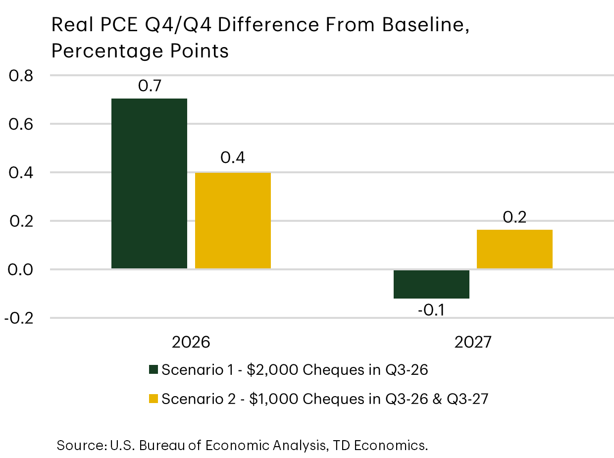
Policy Shift #2 - “Tariff Dividends”
Two other Republican policy proposals came about following wins by Democrats that put cost-of-living concerns front-and-center.
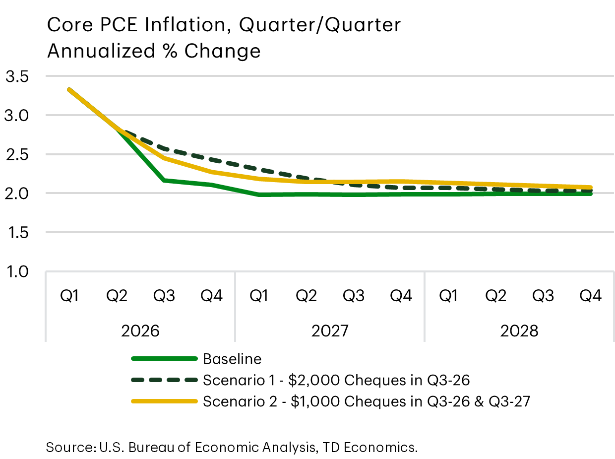
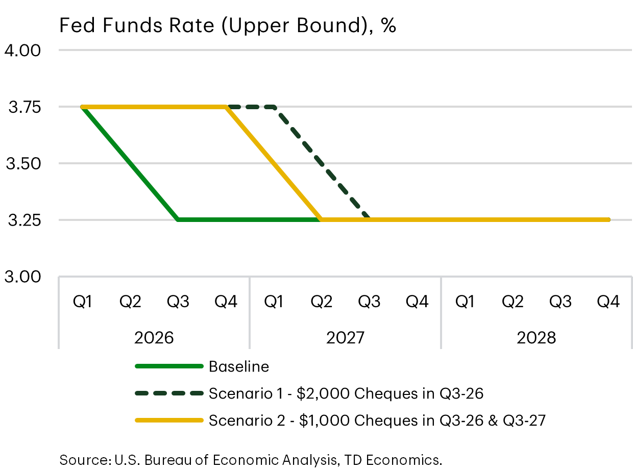
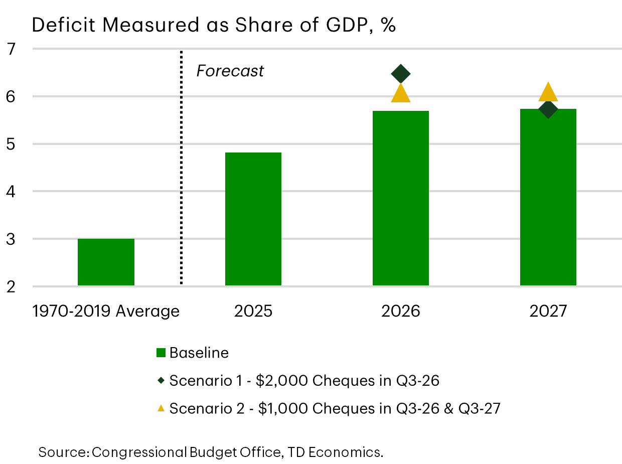
The most intriguing was President Trump’s mention to distribute $2000 to households via the collected tariff revenue. It’s since been reframed as a tariff dividend. Analysts quickly jumped on the math to show that the collective amount to Americans would exceed the value of the collected tariffs annually. Doing so would put the stimulus on par with the American Rescue Plan. The black lines and bars in these graphs show the large knock-on impacts to consumer spending, inflation, our fed funds expectation and government deficits.
Since this seemed unrealistic we created a second scenario deemed more realistic to how rhetoric has since evolved, represented by the gold lines and bars. We assume the tariff dividend concept reflects a 50% distribution of revenues to tax filers with incomes below the $80,000 threshold, and the rest of the tariff revenue dedicated to debt paydown. And we assumed that the holds in place a couple years, rather than being a one-off payment.
Doing so still provides a meaningful lift to consumer spending, in part because lower income households are more liquidity constrained, causing their spending multiplier from a government transfer to be higher than other segments of the population, where there’s a greater tendency to save the extra funds.
The bottom line is that anything that materializes with this concept of a tariff dividend would boost our economic outlook, but it needs to be viewed dynamically with adjustments in our fed policy expectations and deficit projections. In other words, markets may impose a higher risk premium on yields that erodes some of the net benefit to households.
Policy Shift #3 – Housing Affordability
The second affordability proposal by President Trump relates to housing and falls under two concepts that would lift our forecast for both home sales and prices.
The first is the idea of portable mortgages – which allow borrowers to transfer their existing loan and rate to a new property. This is being discussed to ease the “locked-in” effect that’s holding back supply because people don’t want to give up favorable mortgage rates for new contracts that are above 6%.
The second proposal is the 50-year mortgage, which could drop the average mortgage payment on a median-priced home by $150-250/month. However, extending the amortization period also nearly doubles the interest paid over the lifetime of the loan, if carried to maturity. It’s possible the 50-year mortgage would have limited appeal.
Regardless, both policy measures require time for legislative changes and implementation, which could take up to a year. Of the various new policy proposals, the tariff dividend has more far-reaching tentacles into the economy relative to any changes that may occur in the mortgage market.
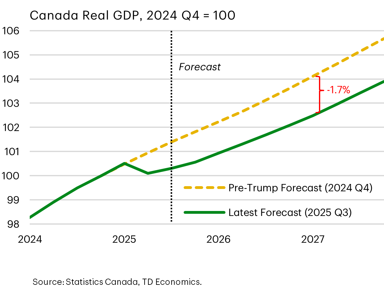
Trump Tariffs Cause A Step-down In Canada’s Economic Fortunes
Jumping over to Canada, rather than growth rates, where we have Canada trending in a 1-1.5% range next year, this gives a better picture of the permanent level shift down in economic activity relative to our expectations prior to Trump’s term.
Even with the exploration of new jobs, capital investments and export markets, the transition still leads to scarring with job displacement, skills mismatches and the less efficient use of capital until the economy has more time to re-organize.
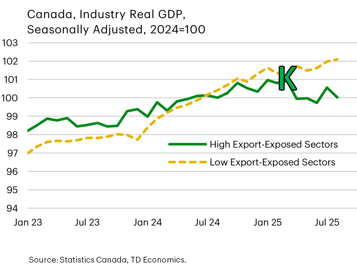
The Canadian K-economy Taking Shape…
This graph captures how those structural dynamics in Canada play out, where an already gradual expansion in high-export industries is now in reverse and at odds with other segments of the economy.
This can be described as Canada’s K-shaped economy that’s forming more decisively, but differs quite a bit from what we’re seeing in the U.S. for a couple reasons.
First, although higher wealth individuals benefit more from stock market gains just like anywhere else, the income side of the equation in Canada shows much less disparity and is flatter between groups.
Second, the job market is showing surprising contradictions relative to its southern peer.
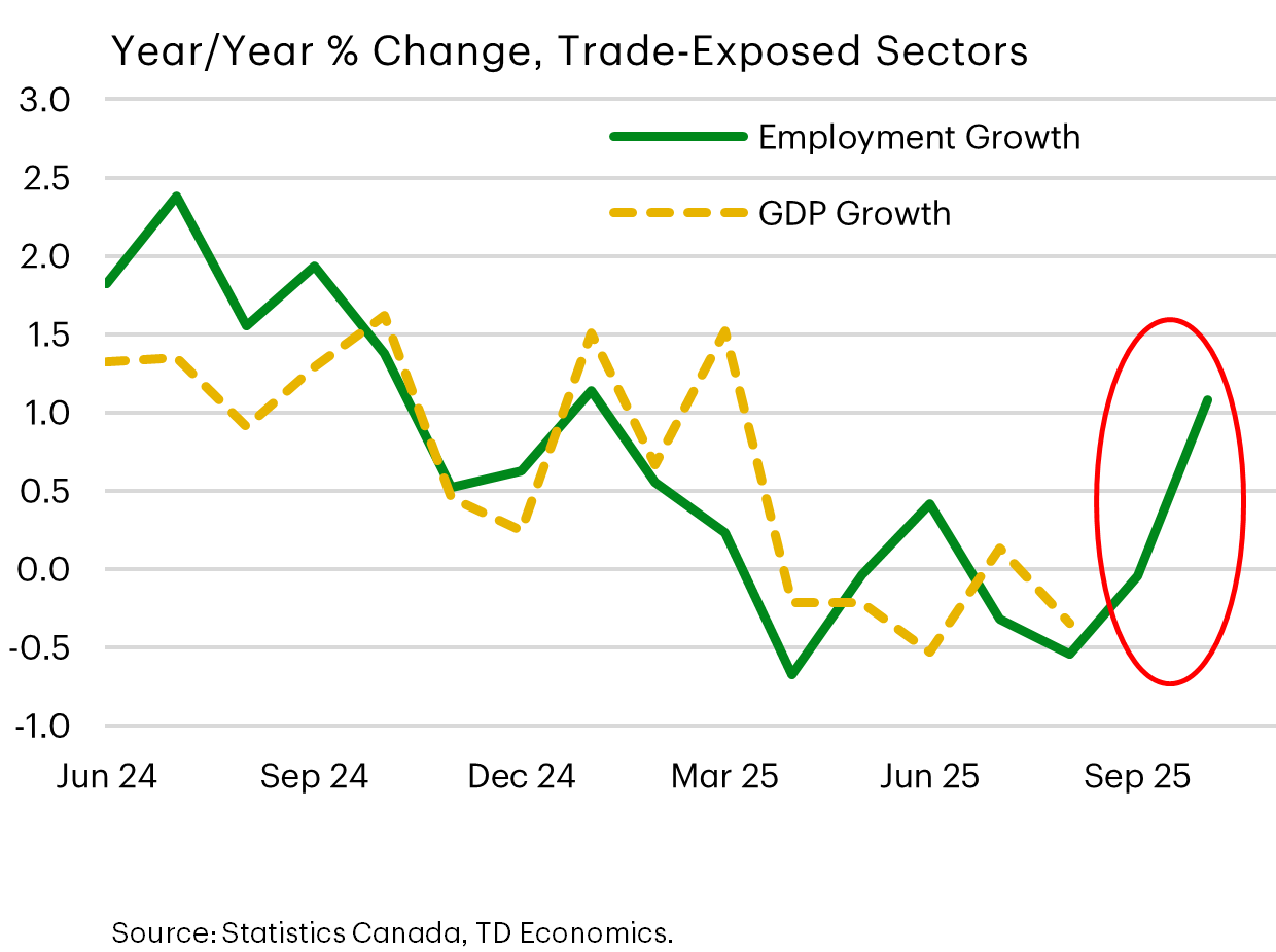
…But Labour Demand Suddenly Defies Expectations
Let’s start with the big picture. Up until August, the job market was mirroring the slowdown in output within trade-exposed sectors. And then a big schism happened in September and October.
Since we don’t yet have October output by industry, it’s possible that activity in tariff-exposed industries gained traction in the latest month, leaving no contradiction with job creation. But that still doesn’t solve for this other graph.
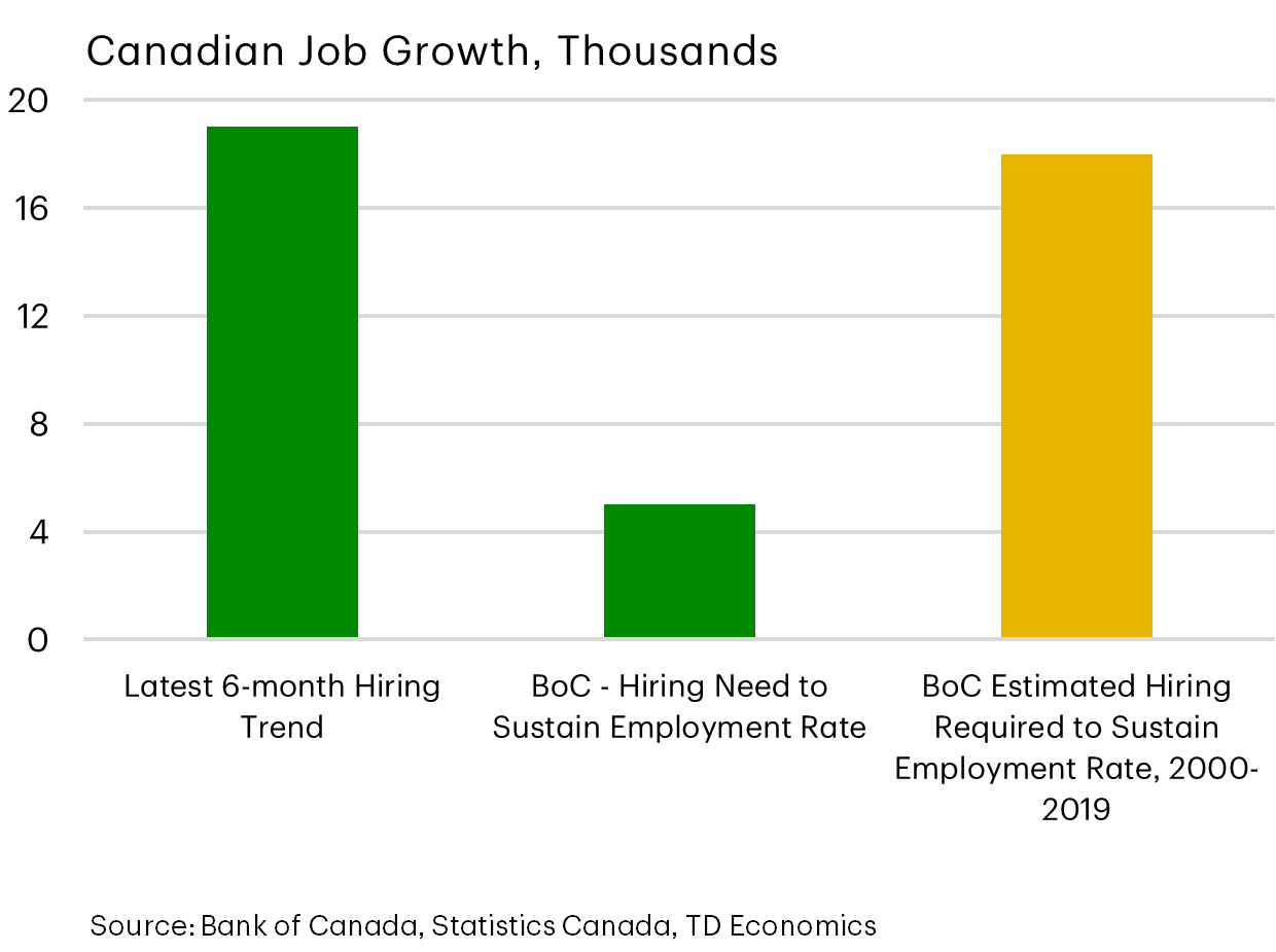
The amount of hiring in the past 6 months mirrors that in the decade prior to the pandemic (shown by the gold bar). With labor force growth hitting stall speed due to a dialing back of immigration, the Bank of Canada estimates that only 5K jobs a month are needed to sustain the employment rate, and we’re averaging 3 times that amount.
This has caused the unemployment rate to be range bound between 6.9-7.1%, whereas the U.S. unemployment rate has trended up 30 basis points since June.
Now it’s not all rosy news.
- The breadth of the recent job growth has narrowed despite the bounce back.
- And it’s possible that the dynamics at play represent employers who hit the pause button earlier in the year on hiring and are now revisiting that decision, making it a temporary boost.
I’m inclined to believe this to be true, and our forecast does embed about 40K more job losses into the first quarter. But that doesn’t take away from this reprieve being good news and speaking to Canada’s resilience.
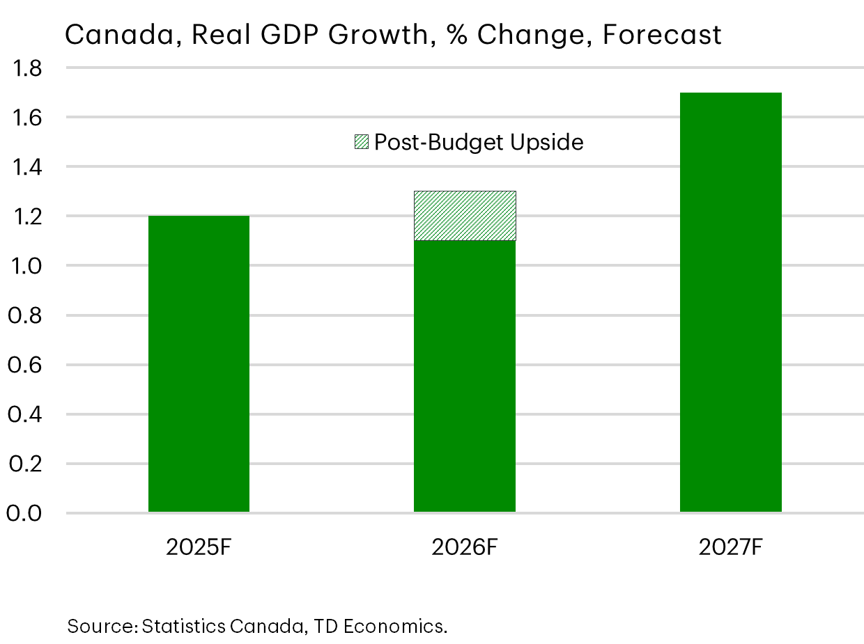
What’s “Transformative” About Budget 2025?
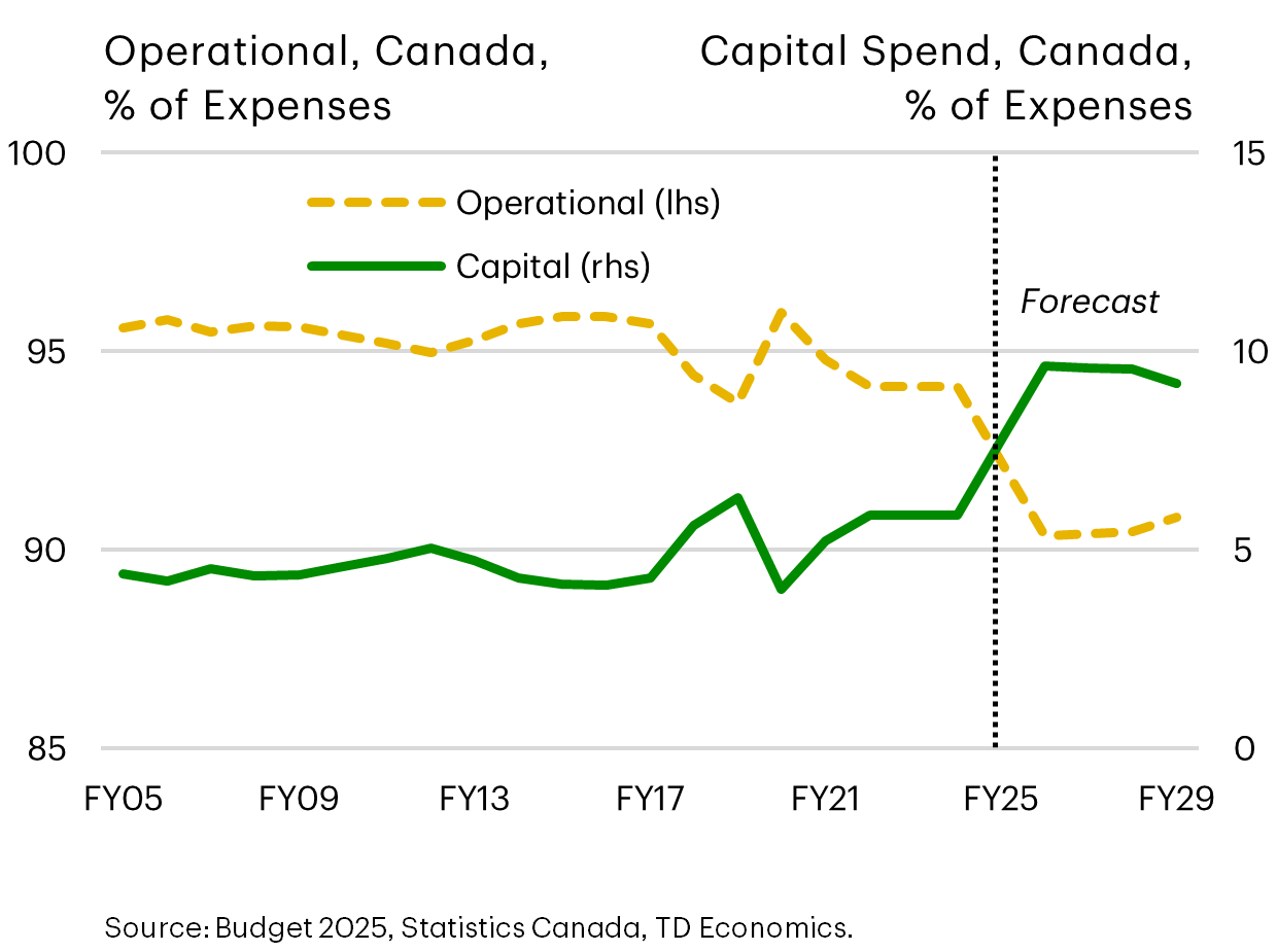
And now there’s a helping hand coming from the government. The Federal Budget was the big event this quarter with many hoping it would be truly transformative for the economy. It wasn’t, but it was a solid “first step” in what will need to be many more.
I’ll start with what I liked, which is exactly what this graph depicts. The shift from operational expenditures to capital expenditures is the right tone to support investor confidence and the economy.
In addition, the budget streamlined some of the decision rights, such as shifting project evaluations from the Ministry of Finance and the Treasury Board to the newly formed, Major Projects Office and Canadian Infrastructure Bank. And, It had a lot of one-off tax incentives to improve the business environment, but just didn’t go far enough to be considered bold.
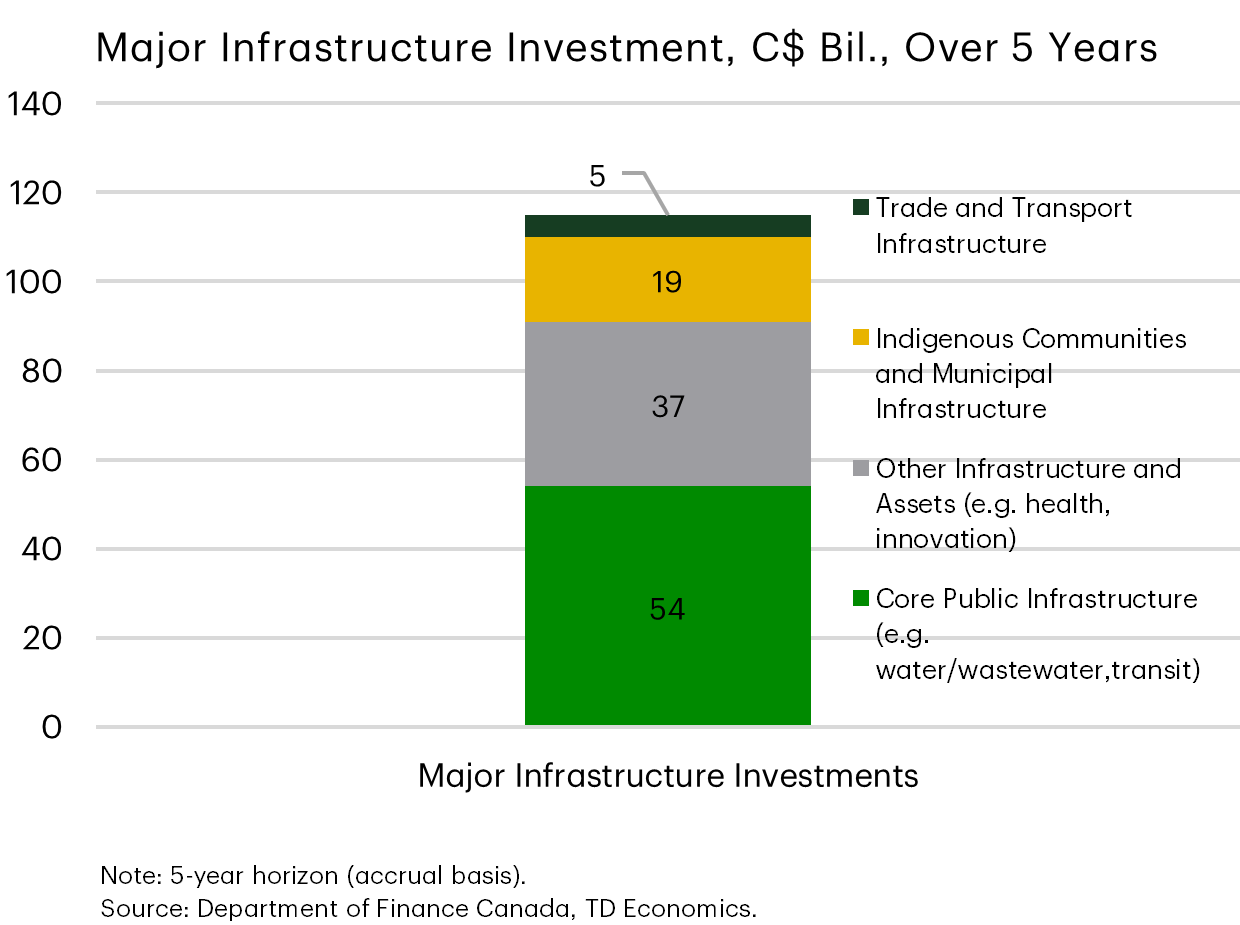
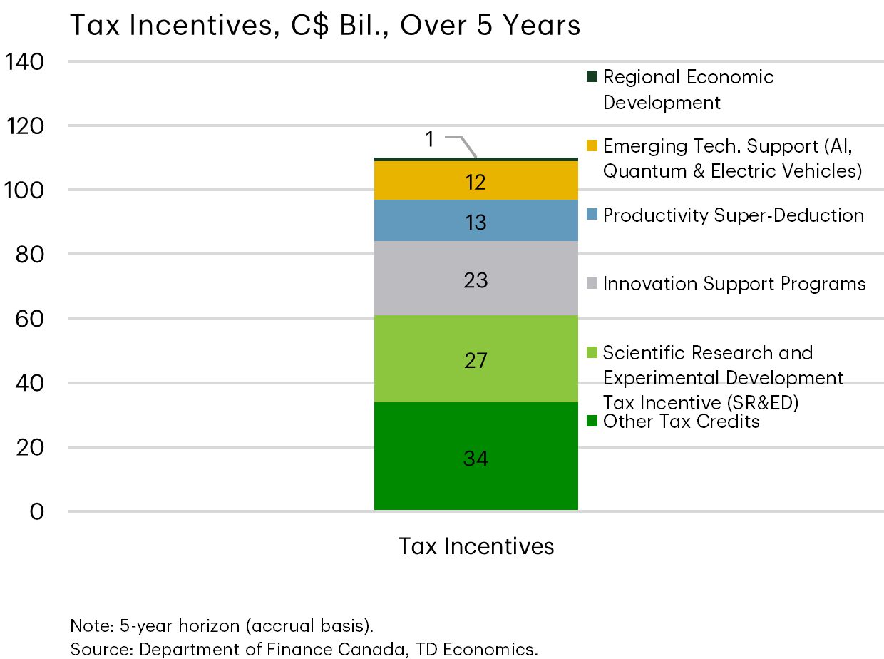
Big Spending on Infrastructure and Business Supports
Here’s the snapshot that the Liberal government has touted as transformative. There’s $115 billion dedicated for items that are infrastructure in nature, and another $110 billion is dedicated to productivity or competitive enhancing business measures.
This is a two-pronged approach to boost output and business incentives, where the combination is hoped to scale up to $1 trillion if the private sector takes the bait, along with various levels of governments on participation. So that’s risk #1, because we’ll see how many projects find dancing partners to leverage the scale of opportunity.
If you look at the items listed for investment, the budget harkens back to an economy in 1960s, focused on mining, infrastructure and other traditional areas. However, there wasn’t enough focus on the future-ready economy for the year 2060 in aggressive commitments within services, A.I., or to just step out of the way of picking industries and let market forces have more say by providing a broad competitive tax landscape.
You could hang your hat on the Productivity Super Deduction or the SR&ED programs, but they don’t match the scale and scope of what we saw out of the United States. SR&ED will benefit from a higher annual expenditure limit of 6mn instead of 3mn, but the U.S. equivalent is uncapped for eligible expenses.
The Productivity super deduction is a renamed capital cost allowance from the Trudeau years. It was expanded to include manufacturing and processing facilities but is still narrower in scope to the U.S. version and only extends to 2030 versus being permanent, as it is stateside.
So this budget nibbled around the edges, applying well-worn and familiar policies. But there wasn’t a big-bang moment to the magnitude of the competitive challenge facing Canadian businesses. No matter the trade deal eventually cut with the United States, companies will have less and more costly access to the U.S. marketplace compared to prior years. So, while the budget tilts the competitive landscape in the right direction, it may not do enough to kickstart transformational change.
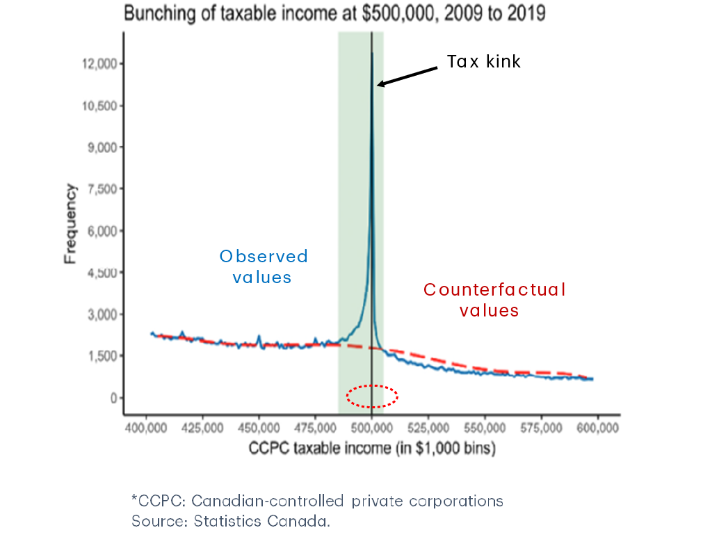
Kinky Tax Incentive For Businesses To Remain Small In Canada
Here’s just one example of what the budget didn’t do that needs addressing. The obvious missing piece was an overhaul of taxes, both on the household and corporate side.
This graph amplifies the distortionary corporate tax system in encouraging businesses to remain small and under-invest. It’s Statistics Canada research that looked at the behaviors of businesses.
The report found that the rapid climb in the tax rate once a company exceeds taxable income of $500,000 leads to a bunching of companies at that threshold. Companies are incented to investment in areas with the highest depreciation rate, like trucks at 20%, instead of expanding into new facilities, where the depreciation rate is only 6%. And research into programs like SR&ED have shown the net benefit is questionable given that most public dollars go towards small businesses that do not necessarily add to the productivity picture.
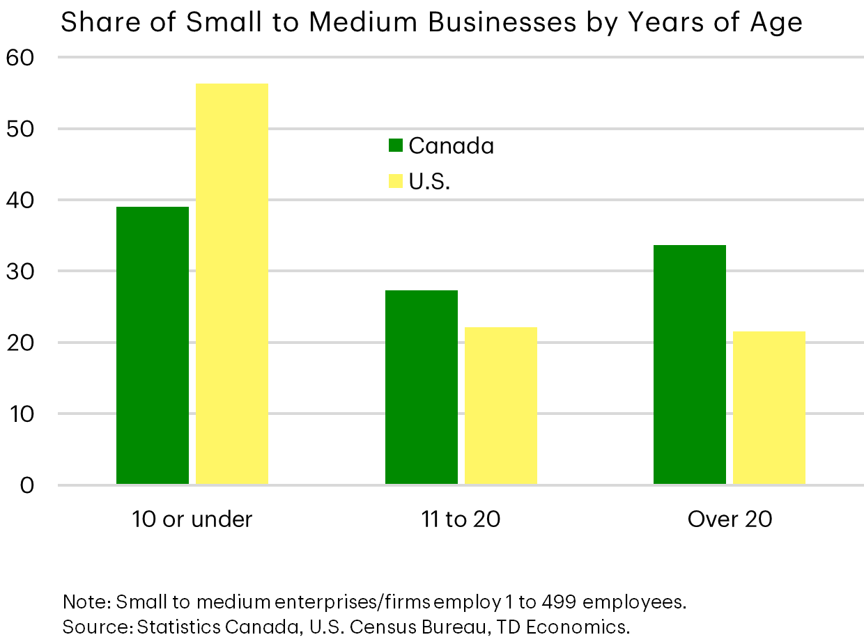
It’s not small businesses that drive innovation and job growth, it’s young businesses. That’s an important distinction.
In Canada, 60% of small businesses are aged 11 years or older, compared to 40% of U.S. businesses. Canada’s tax system is great at supporting small firms but not necessarily growing new firms. It’s the latter that are more likely to adopt new technology and displace inefficiencies among incumbents.
You can see this manifesting in other areas. The business equity share of assets held by households with net worth above $10 million has fallen by more than half between 2016 to 2023, whereas business valuations globally have more than kept pace with other assets. Even broadening the scope to include less-wealthy households and individuals between the ages of 25-64 maintains the same trend.
The message is that Canadians are relying less and less on business growth to drive personal wealth gains, which raises questions around business dynamism and Canada’s calling card to attract and retain entrepreneurs and top talent.
New Spending Impulse Not A Game Changer To Prior Views
Stepping back to put all the pieces together of what’s on offer, there is the potential for the budget to add 20-30 basis points to GDP growth in 2026. But this requires policymakers across all government levels to deliver on disbursements. For now, we’ve held back formalizing this additional growth in our official forecast until there’s more evidence, and we hope to be pleasantly surprised.
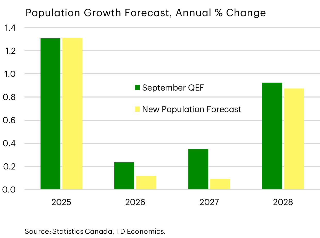
Population Growth Forecast Further Downgraded
I’ll end on the immigration shifts that were announced in the Budget and implications to our outlook. The government scaled back already reduced expectations, exclusively within temporary resident targets for 2026 and 2027. Between the two broad categories of temporary workers and planned student permits, the weight was disproportionately born by a 50% cut in study permits. And this was enough to move the dial on our population forecast.
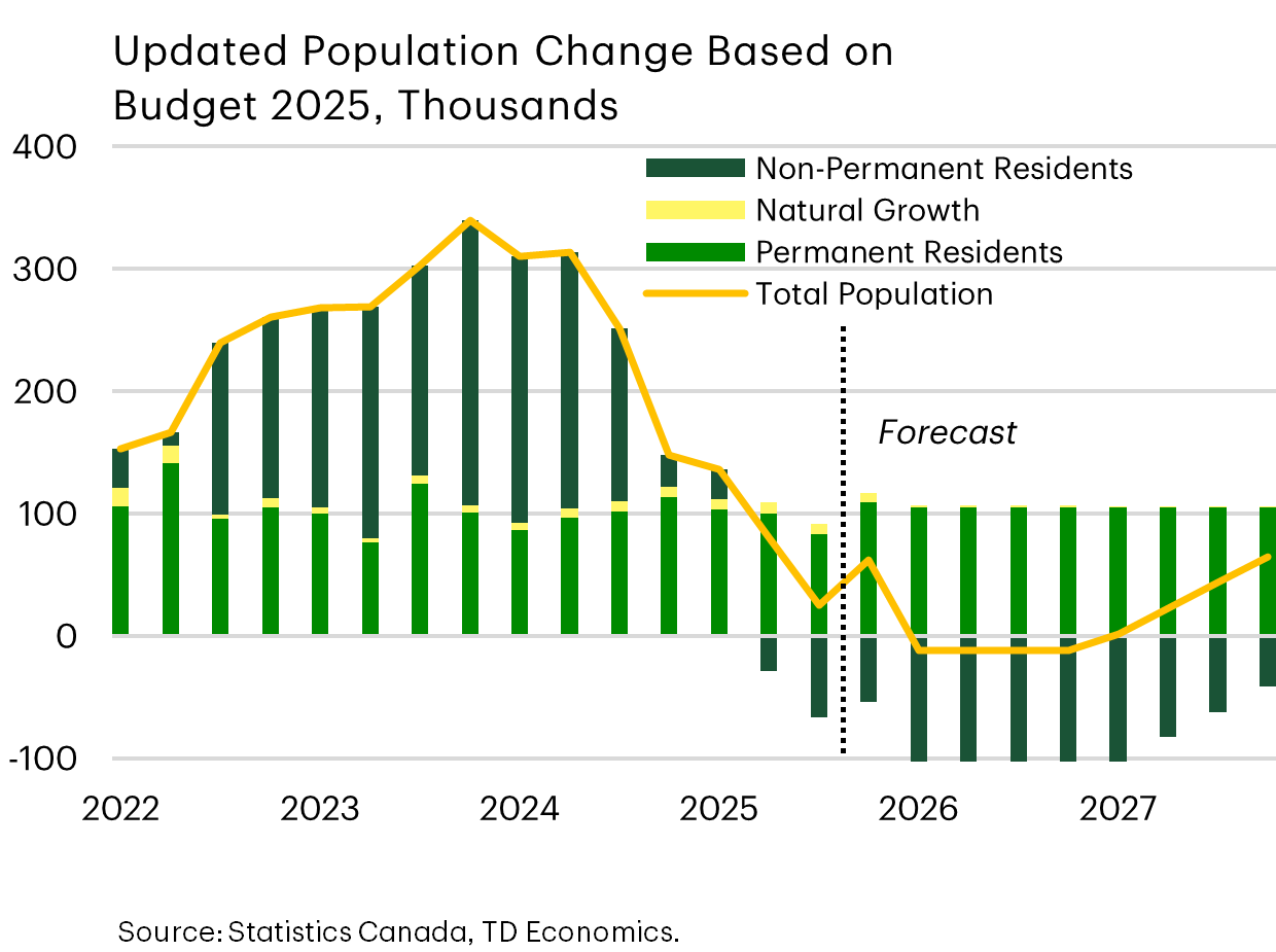
Type Of Immigration Matters For Type of Housing Demand
<p">It’ll be the first time in history that Canada will have a contraction in total population for about one year, shown by the line in this graph. Importantly, the government did not change the target for permanent residents, and in fact nudged it up by 15K to 380K through 2028. But they indicated that priority will be given to those already present in Canada, perhaps here on temporary status. So overall impacts on population growth will be limited from this group.</p">
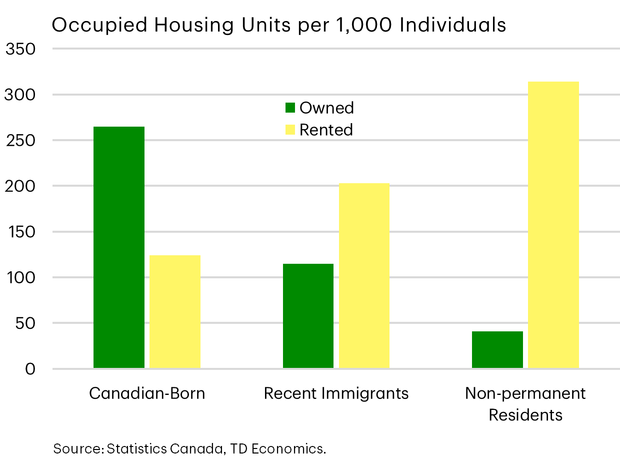
Why does it matter?
The type of immigrant has different impacts on housing demand and construction needs. Non-permanent residents are six times more likely to rent. In contrast, those under the “recent immigrants” category start off disproportionately as renters but then shift to a 50-50 split between ownership and rental within 5-6 years of being in Canada.
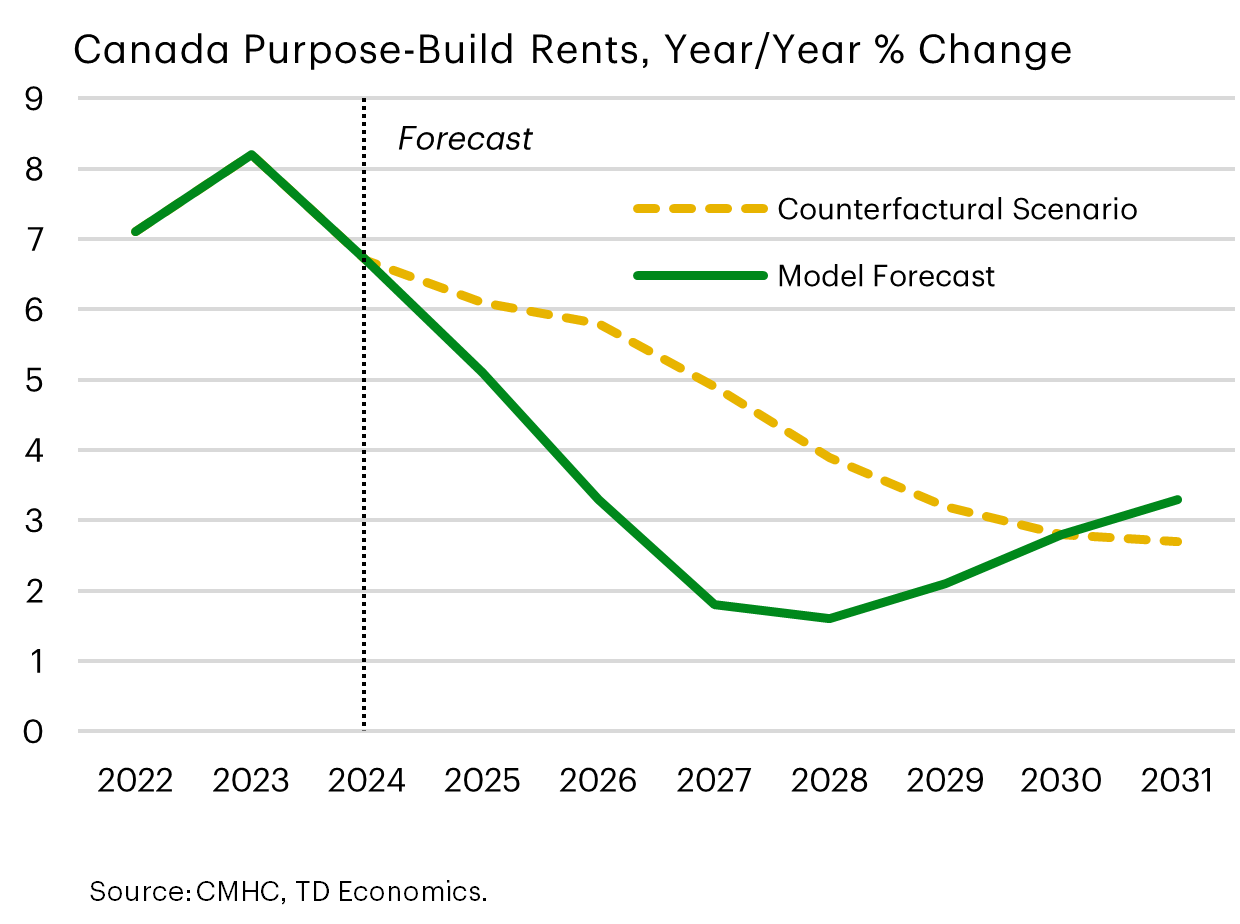
Rent Growth Would Be 2 Percentage Points Stronger Per Year
Dovetailing this into our outlook, the shift in immigration policy does seem to be having the intended effect of creating better balance with the capacity of the social and economic infrastructure.
When we isolated the impact of population growth on rent growth, purpose-built rental prices would have been two percentage points higher if the government hasn’t dialed down immigration. That would have left held rent growth at nearly two times the historical average, further crippling affordability. Now that’s the estimate for the average Canadian, but real estate is very local.
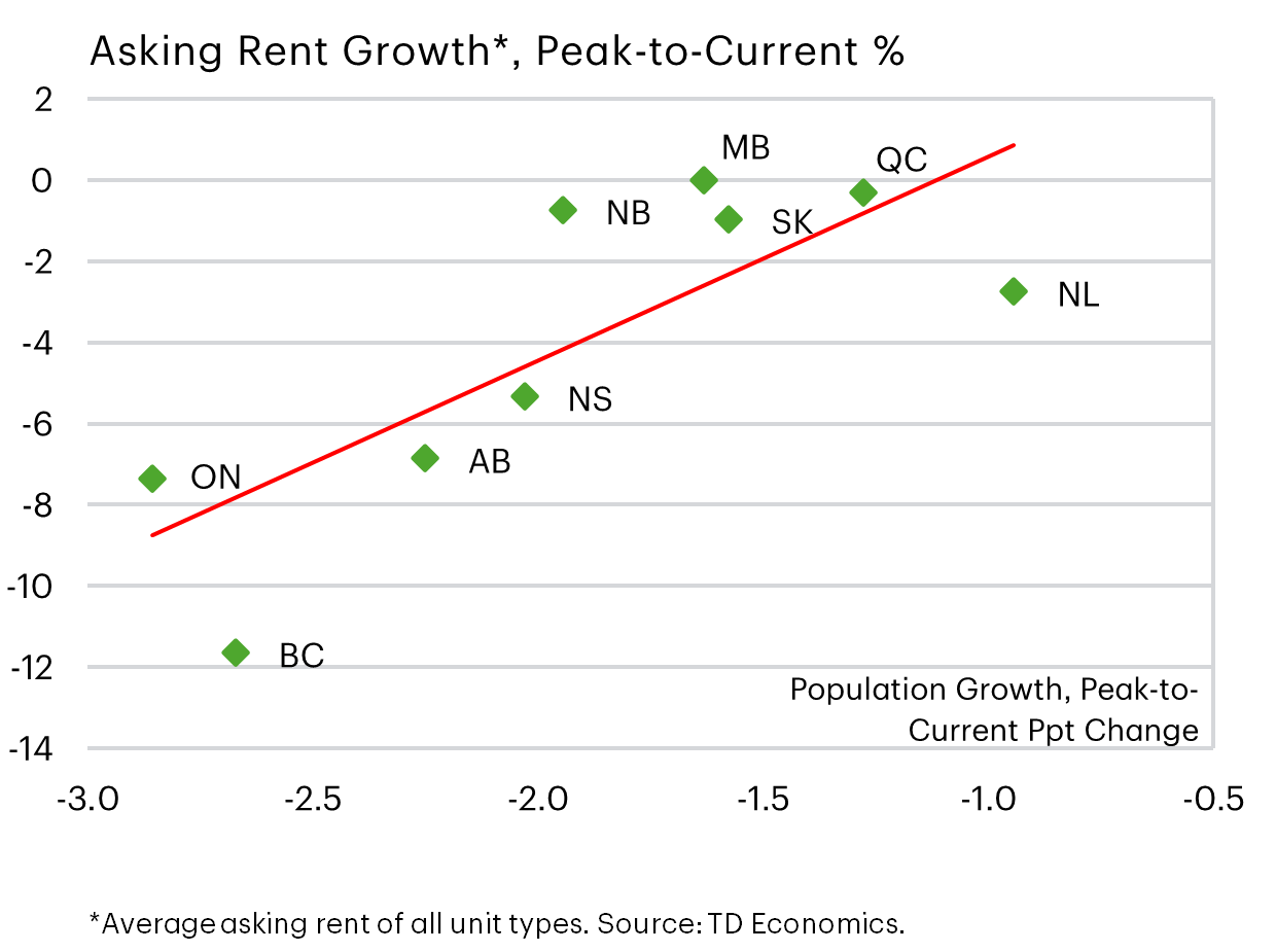
High Immigration Regions See Greatest Shift in Rent
This graph plots the relationship between rent and population growth by province. It’s clear that Ontario and B.C. markets are bearing the brunt of falling rent with the scaling back of non-permanent residents. The policy likely creates a more elongated recovery cycle for both purpose build rental and the secondary condo market where supply is highest in these provinces relative to the rest of the country.
In the homebuyer market, particularly for detached homes, there’s not a strong statistical relationship from the direct effect of fewer NPRs. But there are indirect effects through the confidence channel that can cause buyers to move to the sidelines when other segments of the market cool off.
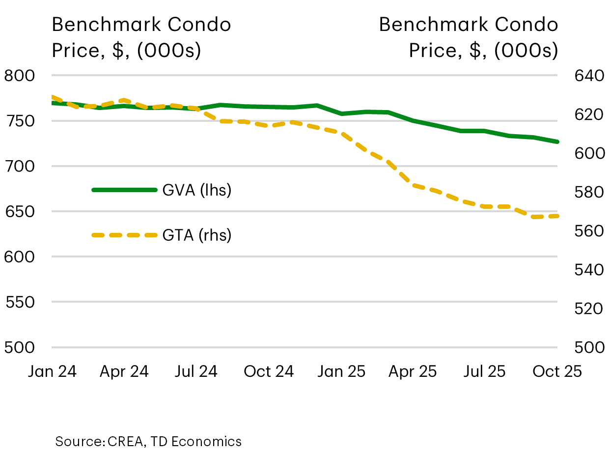
Some Signs of Life in Condo Markets
Now, if you’re talking to a developer in Toronto, you’ll get a doom-and-gloom story. There’s very little foot-traffic for new developments and large projects are getting shelved. But this is the dynamic that clears the market and reintroduces some affordability for new buyers.
For reference, Vancouver condo prices are still 15% above pre-pandemic levels, whereas Toronto prices have already returned to those levels. Some have expressed concern that the recovery cycle still needs to extend two-to-three more years to clear the excess condo supply in Toronto, which is the worse to wear of the two markets. However, the degree of price adjustment will lessen as the market supply incrementally thins in that process.
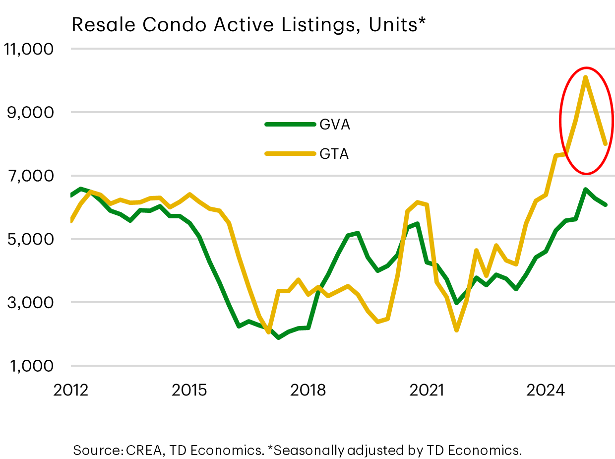
The graph below shows how much more distended the Toronto market became, with a silver lining starting to show up in falling inventories as the price declines attract some buyers. Toronto condo sales are up 10% in September relative to a year-ago. By comparison, Vancouver sales were up 2%.
As the market slowly clears, credit risks will remain front-and-center with condo owners taking possession of units that now have distorted loan-to-value ratios due to falling prices relative to the purchase price. So even though inventories are adjusting, we’re probably not through the credit risk cycle and some pre-sold condos may re-enter the supply chain.
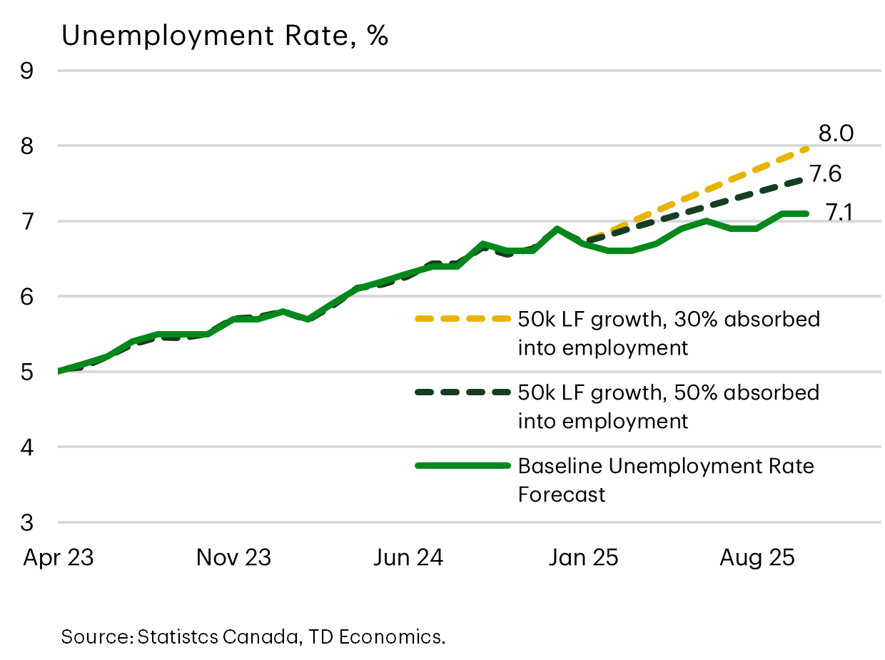
Immigration Shift Constrains Canada’s Unemployment Rate
What about immigration changes and the job market? We estimate that the unemployment rate would likely have hit 8% if the government hadn’t lucked out on the timing given the dramatic shift in the economic backdrop this year for employers. This counterfactual scenario reflects a labor force running at 2023-2024 growth rates with employers absorbing roughly the same ratio of workers as today.
Even in a more optimistic scenario where perhaps the excess supply of labor reduces wage costs and allows for a higher absorption of workers by businesses, there’s still an upward drift in the unemployment rate. Ultimately, both outcomes would have further pressured government finances in EI payments and other social supports.
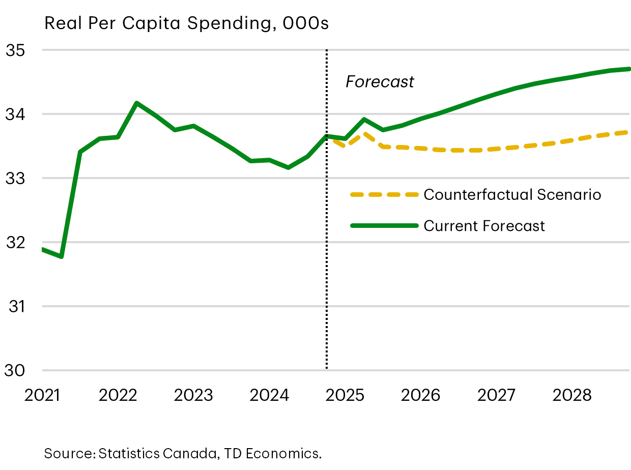
Consumer Spending Sees Little Impact From Immigration Changes
While immigration impacts on housing and the job market were largely as expected, the impact on spending was the exception. Spending per capita rose quickly as immigration was scaled back, and this pattern was a deviation from historical experience.
Typically, upon arriving into the country, spending by new immigrants is high as they draw on their savings to settle and acquire necessities. Once established, that pattern shifts due to remittance payments to family in their home country, increased saving habits, and the challenges of lower average wages compared to those born in Canada. This means the largest negative impact on spending should have occurred fairly immediately as population growth throttled down in the first half of the year.
So what was different this time?
Between 2022 and 2024, 70% of Canada’s population growth was from NPRs who were concentrated in lower wage jobs, or students, or youth…or all of these. These categories naturally have higher unemployment rates relative to the rest of the population. That means nearly a quarter of a million newcomers possessed less discretionary spending power than the general population and past generations of new immigrants. Now add to the equation the abrupt erosion in housing affordability that ate even more of their savings, leaving even less for discretionary spending. The net result is a rise in real per capita spending after almost two years of decline.
This should not be chalked up as a positive, because it speaks to a negative immigrant experience. But the policy shift occurred at a crucial time in the business cycle, and Canada’s economy is no worse for wear. It’s also a reminder that policies can’t be set-it-and-forget-it. This is an important lesson for governments when it comes to tax policy and the evolving global economy.
Disclaimer
This report is provided by TD Economics. It is for informational and educational purposes only as of the date of writing, and may not be appropriate for other purposes. The views and opinions expressed may change at any time based on market or other conditions and may not come to pass. This material is not intended to be relied upon as investment advice or recommendations, does not constitute a solicitation to buy or sell securities and should not be considered specific legal, investment or tax advice. The report does not provide material information about the business and affairs of TD Bank Group and the members of TD Economics are not spokespersons for TD Bank Group with respect to its business and affairs. The information contained in this report has been drawn from sources believed to be reliable, but is not guaranteed to be accurate or complete. This report contains economic analysis and views, including about future economic and financial markets performance. These are based on certain assumptions and other factors, and are subject to inherent risks and uncertainties. The actual outcome may be materially different. The Toronto-Dominion Bank and its affiliates and related entities that comprise the TD Bank Group are not liable for any errors or omissions in the information, analysis or views contained in this report, or for any loss or damage suffered.
Download
Share this: